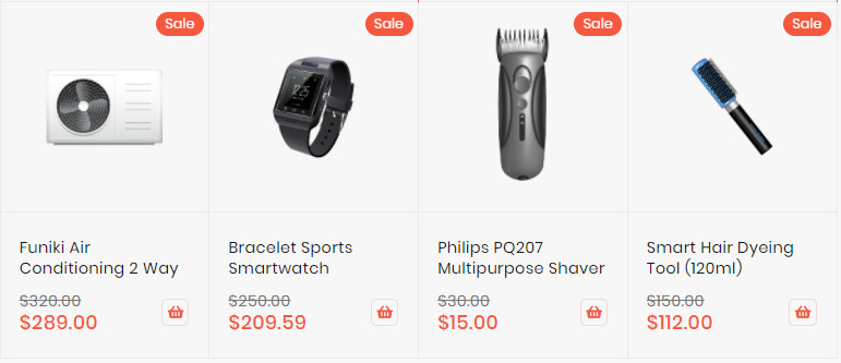
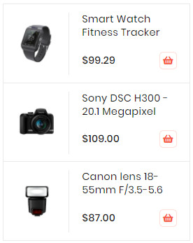
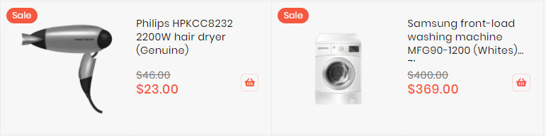
Demo
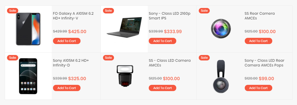
The Sale Products element helps to show sale products, new product by categories with different view options (grid, list, slider, category tabs).
Config Product to Sale
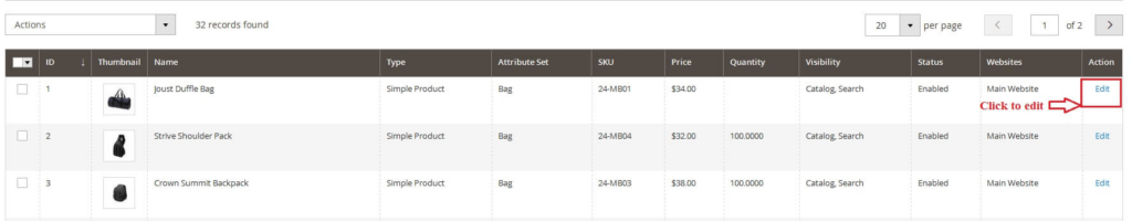
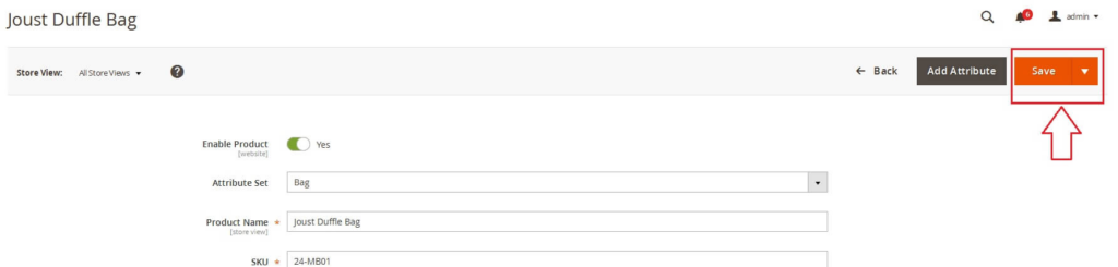
- In backend, go to
PRODUCTS → Catalog. Edit product you want set is new product.
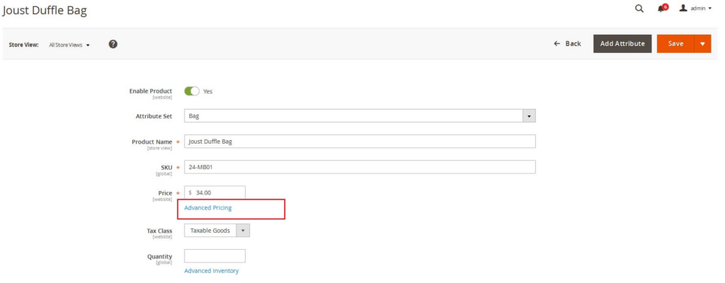
- In the basic settings panel, Click
Advanced Pricinglink
- In the Advanced Pricing panel:
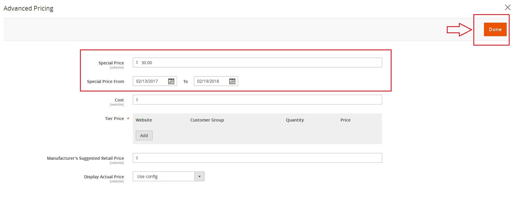
- Enter the number of the
Special Price. - Assign the active time including
Special Price From DateandSpecial Price To Date. You can type manually or click onCalendaricon to choose the relevant date. - Click Done button to close panel.
- Enter the number of the
- Click Save button to save product.
CREATE SALES PRODUCT BLOCK
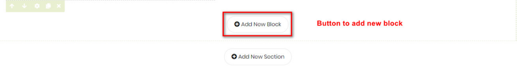
- On builder editor, click Add New Block button.
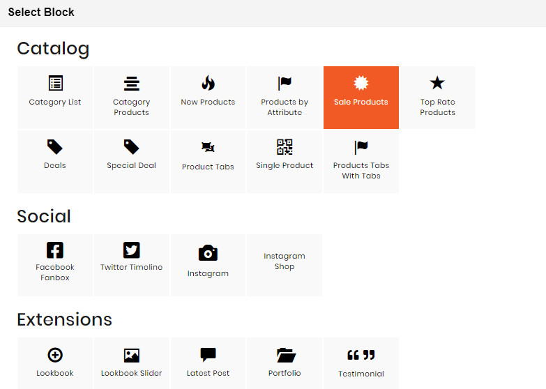
- On popup list blocks, click “Sale Products” item.
CONFIG BLOCK
Product Config Tab
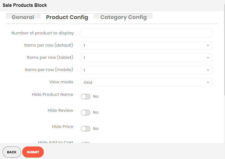
- Attribute: Choose attribute of product to filter.
- Number of product to display: Limit the number of products shown.
- Item per row: Limit the number of items in a row on default resolution.
- Item per row (tablet): Limit the number of items in a row on tablet.
- Item per row (mobile): Limit the number of items in a row on mobile.
- View Mode:
Grid Mode
List Mode
Grid Ultra
- Hide Product Name: Choose Yes to let the product name disappear.
- Hide Review: Choose Yes to let the product review disappear.
- Hide Price: Choose Yes to hide the product price.
- Hide Add to Cart: Choose Yes to hide the Add to Cart button.
- Hide Add to Wishlist: Choose Yes to hide the Add to Wishlist button.
- Hide Add to Compare: Choose Yes to hide the Add to Compare button.
- Use Slider: Choose Yes to add Carousel Slider for block product.
If you use slider, you can see more config to owl slider:
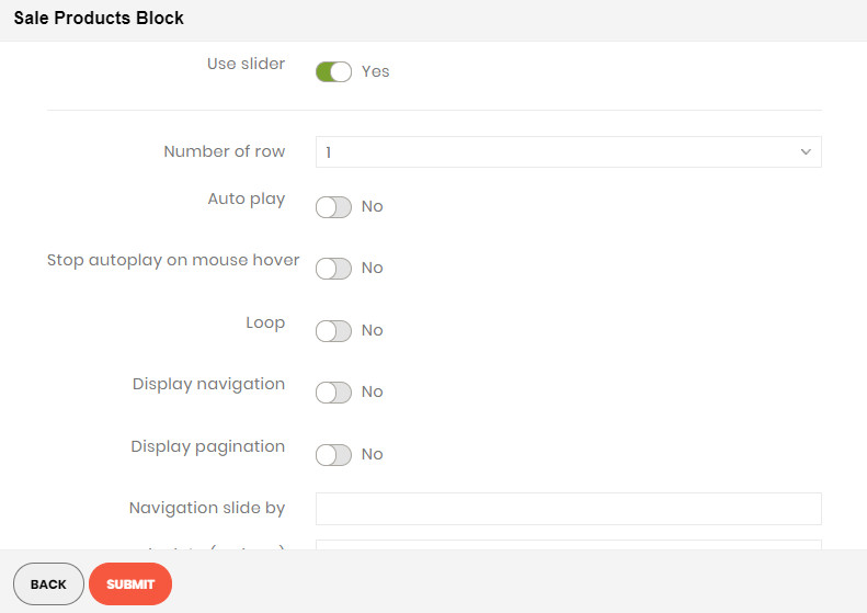
- Number of row: The number of rows displayed in slider.
- Auto play: Choose Yes to let the slide play automatically.
- Stop autoplay on mouse hover: Choose Yes to stop the slide from playing when hover mouse.
- Loop: Choose Yes to let the slide play in loop.
- Display navigation: Choose Yes to display the navigation icons on the slide.
- Display pagination: Choose Yes to display the pagination indicator on the slide.
- Navigation slide by: Limit the number of items will be shown after each time you click on the navigation.
Category Config Tab
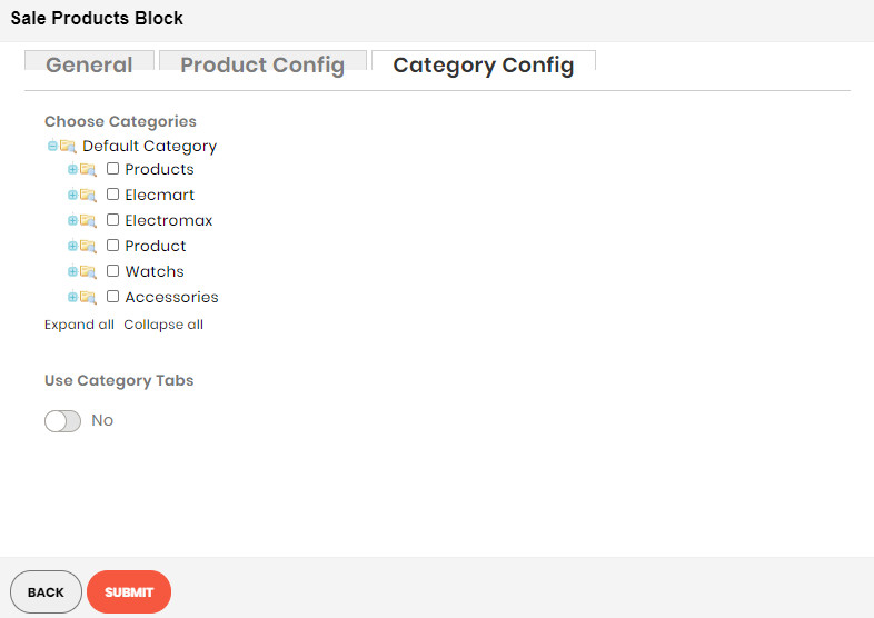
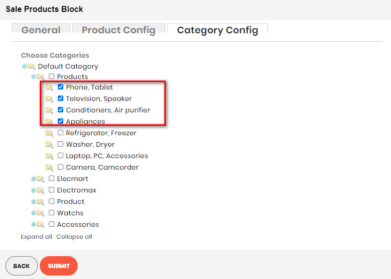
- Click plus icon button to show sub categories.
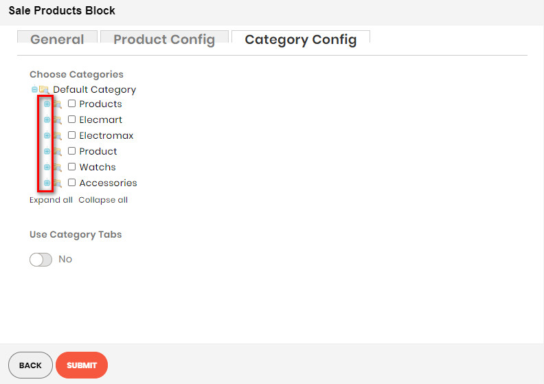
- Choose categories to filter product by selecting categories.
- If you want show product with tab. Change Use Category Tabs to Yes
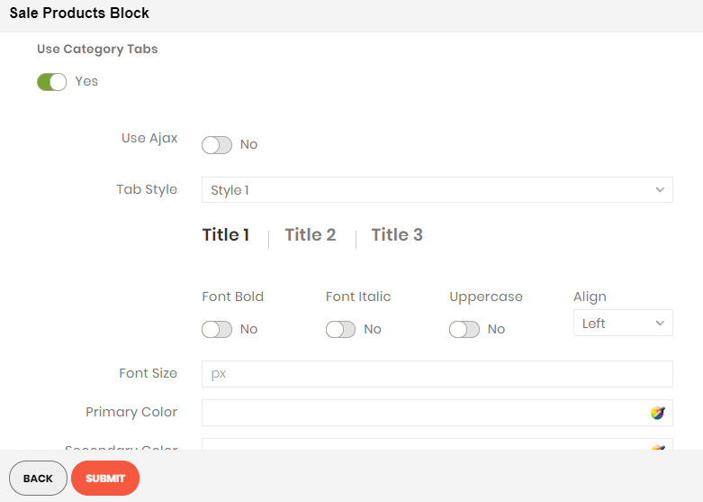
- There you can see more settings for tab slide:
- Tab Style: Choose one of the 7+ style in the list. You can see the demo below.
- Font Bold, font Italic, Uppercase: Choose Yes to let the text in bold, in italic or in uppercase.
- Align: Choose among Left, Center or Right for text align.
- Font Size: Enter the value of font size (in px unit).
- Primary Color, Secondary Color and Third Color: Choose the 3 main color for your category tab. You can enter the hex code color directly in the blank or use color picker tool at the right.