- Slide
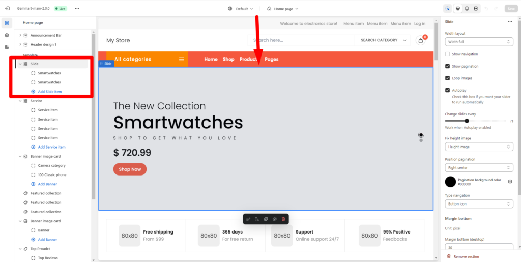
Within Slide, you can config:
- Width layout: Container, Large container, Full width.
- Enable/Disable Show navigation
- Enable/Disable Show pagination
- Enable/Disable Loop images
- Enable/Disable Autoplay: Check this box if you want your slider to run automatically.
- Change slides every: Work when Autoplay enabled.
- Position pagination: you can choose Left bottom, Center bottom, Right bottom, Right center.
- Position background color.
- Type navigation: Button icon, Button icon and tittle.
- Margin bottom: Margin bottom on desktop, tablet and moblie.
- Custom CSS.
You can add slide item by click Add Slide item. For each slider, you can edit Slide item and Config Block.
– Slide item:
- Image: choose image for slide.
- Overlay slide
- Slider effect: hidden, fadeInUp, fadeInDown, fadeInLeft, fadeInRight.
- Position content
- Text align content
- Sub title and Tittle
- Description
- Slide url
– Config block:
- Font size sub title: change font size.
- Font size title.
- Font size description
- Color of sub tittle, tittle, description.
- Button type
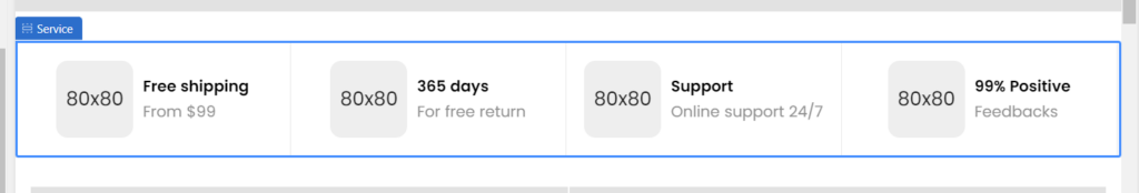
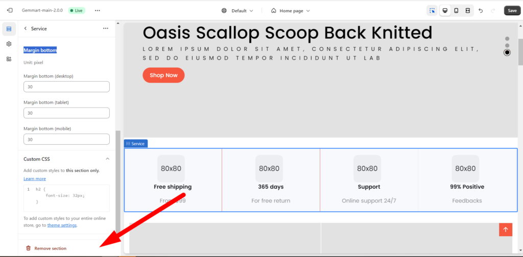
2. Service
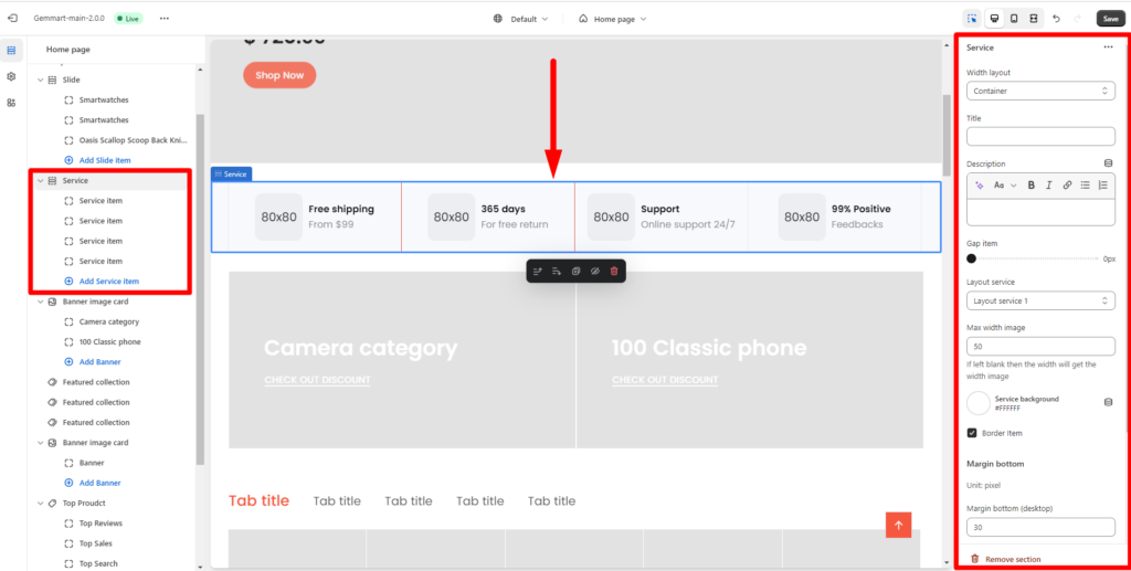
You can add service by click Add Service item. Then config service by sidebar as :
- Width layout: Container, Large container, Width full.
- Tittle: Add tittle for service.
- Description
- Gap item: space between items.
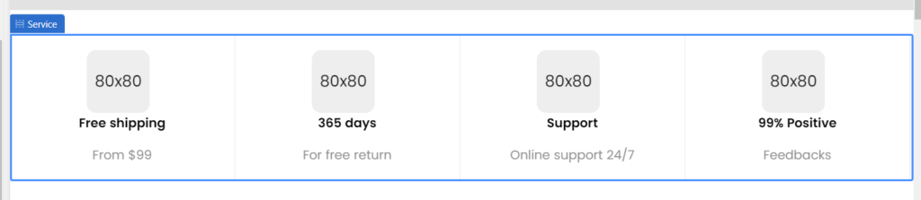
- Layout service
– Lay out 1
-Layout 2
- Max width image: If left blank then the width will get the width image
- Service background
- Border Item: enable or disable.
- Margin bottom on desktop, tablet and moblie.
- Custom CSS
Or you can remove service:
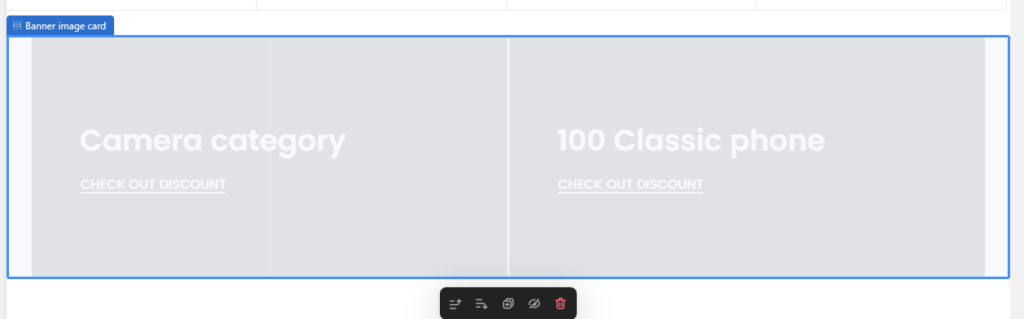
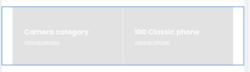
3. Banner image card
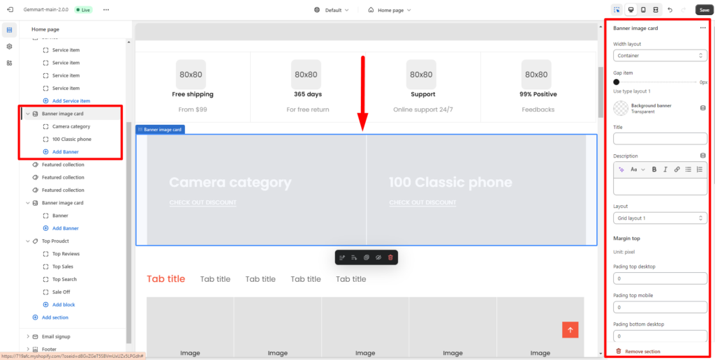
You can add banner image card by click Add Banner. Within banner image card , you can config:
- Width layout
– Container:
– Large container:
– Width full:
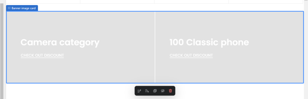
- Gap item
- Background banner: you can change background banner color by choose another color and change layout.
- Margin top: padding top and margin top on desktop, mobile, tablet
- Margin bottom: Spacing of next row of banner on desktop, mobile, tablet.
- Custom CSS
- Remove section by click on Remove section.
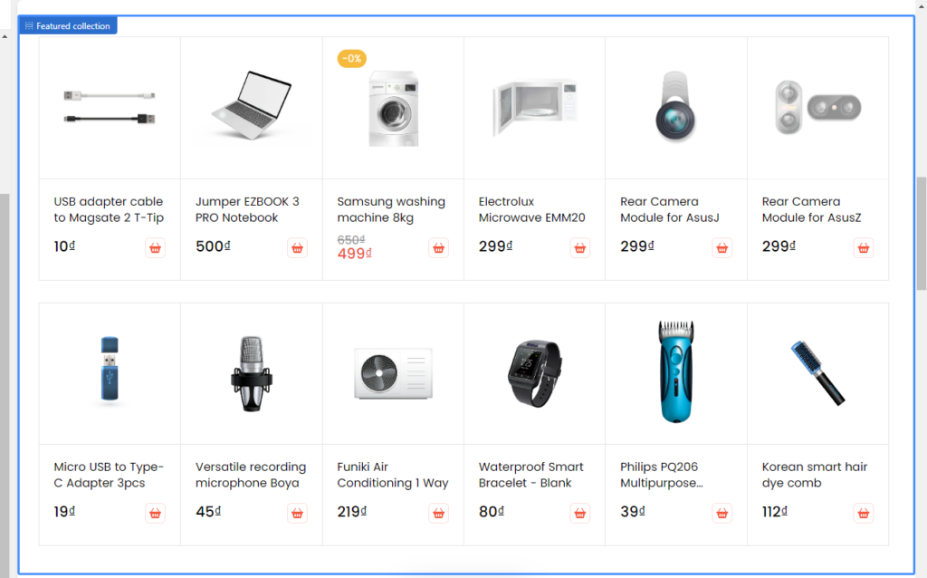
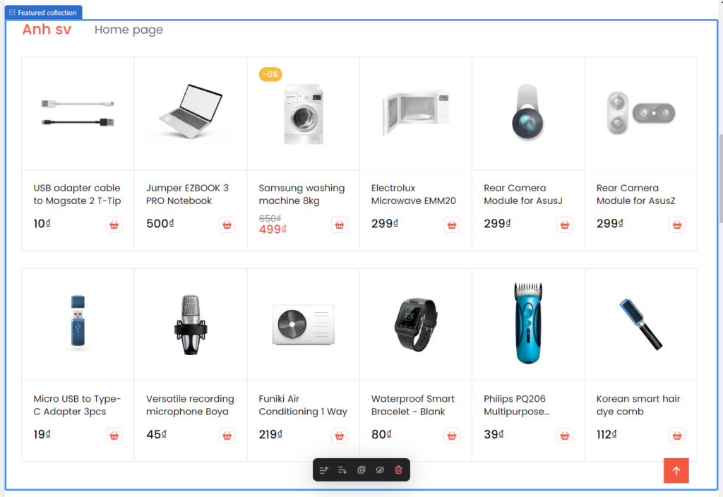
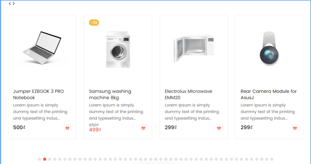
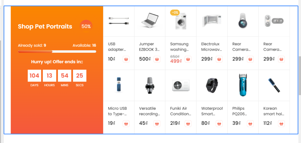
4. Featured collection
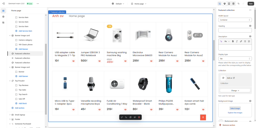
For each Feature collection section, you can edit:
- Width layout: Container, Large container, Width full.
- Heading: add heading for featured collection.
- Collection: Choose your collection to display.
- Display type: select the style you want to display and select the corresponding profile below
Normal:
Tab: tab will be displayed when you select at least 2 collections.
Slide:
Banner:
- Background image
- Background color
- Background Full Width: enable/ disable background full width.
- Pading top and bottom
- Maximum products to show: Select the number of products to display.
- Column number product: Apply to tab, banner and normal style
- Config type tab: change or remove collections, edit style button tad
- Config type slider: choose layout slide, show navigation, show pagigation, slider preview.
- Config type banner……
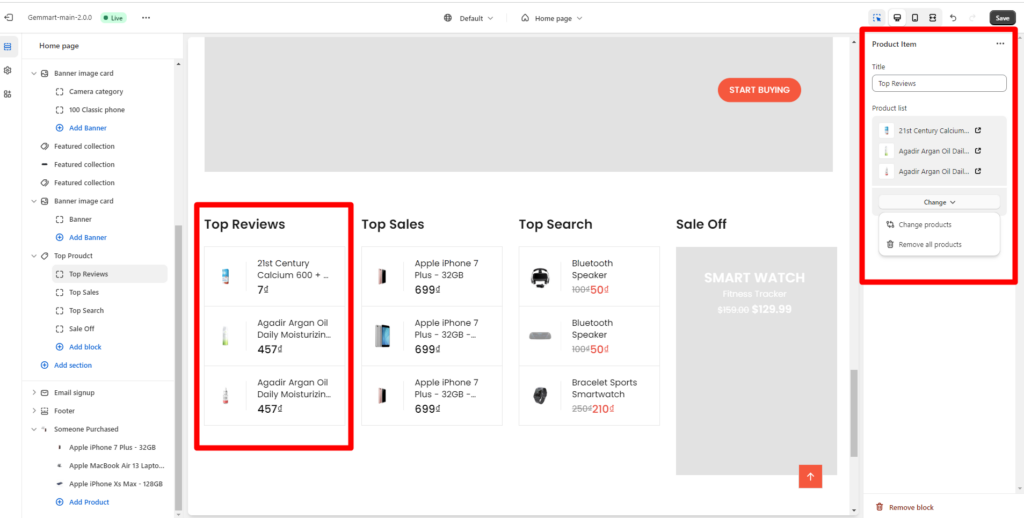
5. Top product
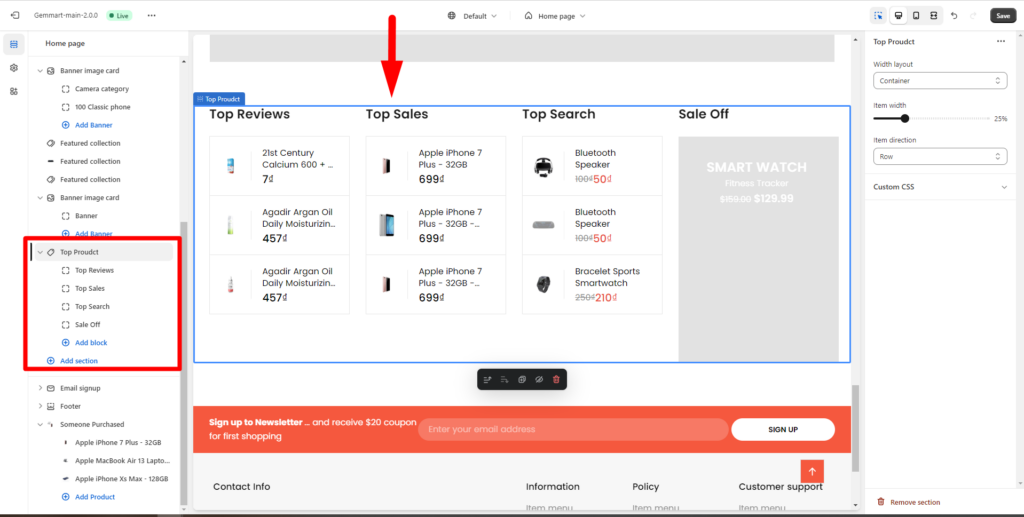
With Top product, you can config width layout, item width, item direction and custom CSS.
To edit one top product, you can edit tittle, change product list of this top product