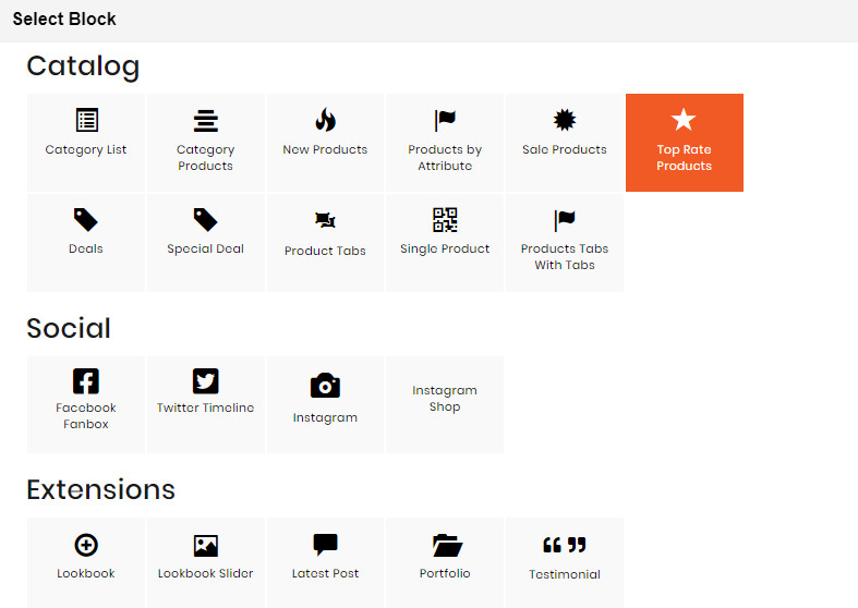
CATEGORY LIST BLOCK
The Category List element helps to create list of categories with a lot of configurations.

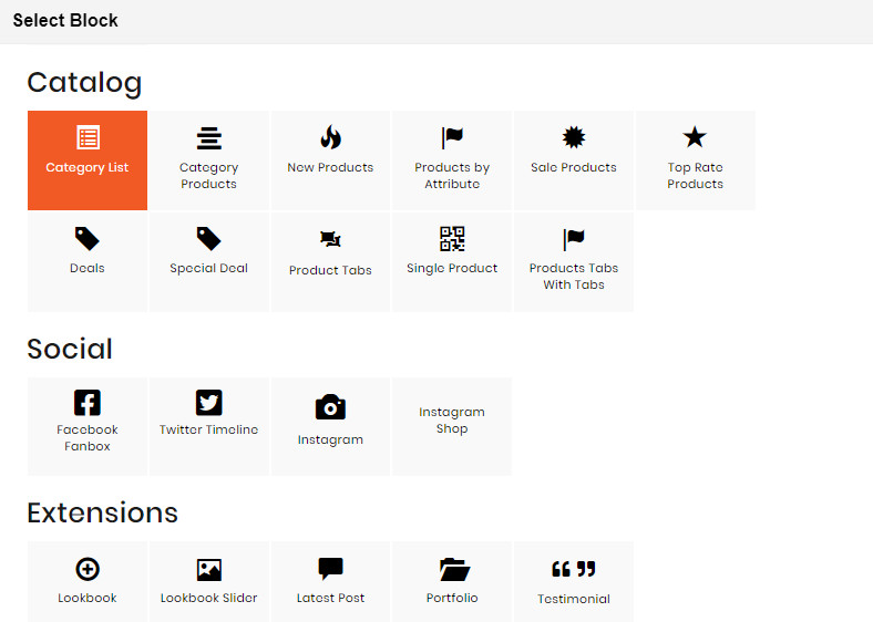
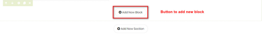
- On Builder editor, click Add New Block button.
- On popup list blocks, click “Category Products” item.
CONFIG BLOCK
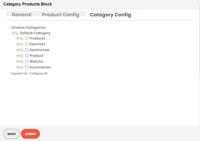
Category Config Tab
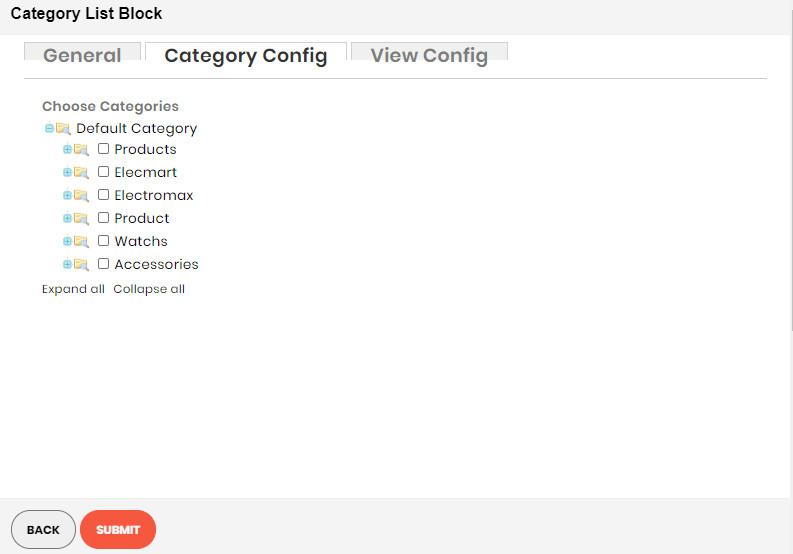
- Click plus icon button to show sub categories.
- Choose categories to filter product by selecting categories.


View Config Tab
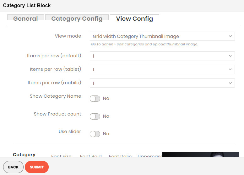
- View Mode: Choose the way to display your category list. There are 2 kinds of
style:
- Grid with Category Thumbnail Image:
- Items per Row: Number of categories in a row.
- Show Category Name: Choose Yes to show category name in the category list block.
- Show Product Count: Choose Yes to show the number of products belonging to category.
- Use Slider: Choose Yes to show list of category in a slider.
- Category Name: Settings for category name including font size, font bold, font italic or uppercase.
- Other text: Settings for other text appeared including font size, font bold, font italic or uppercase.
- Colors: Set 5 color values used in category list.
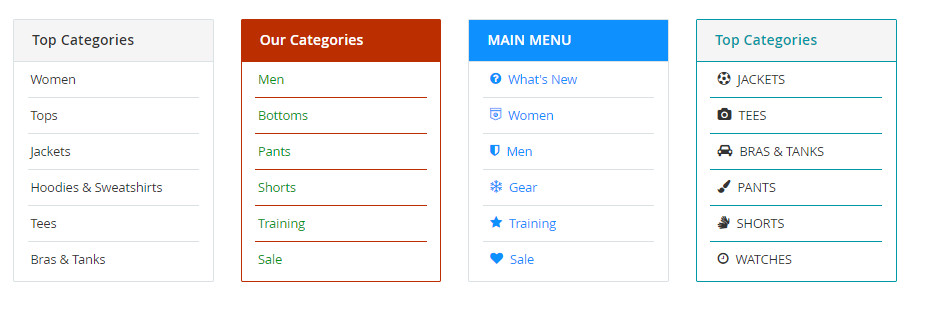
- List:
- Items per Row: Number of categories in a row.
- Title: Set the top title for category list.
- Show Icon: Choose Yes to show the icon of category.
- Grid with Category Thumbnail Image:
- Category Name: Settings for category name including font size, font bold, font italic or uppercase.
- Other text: Settings for other text appeared including font size, font bold, font italic or uppercase.
- Colors: Set 5 color values used in category list.
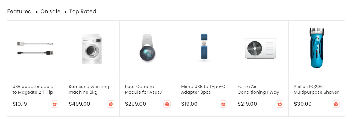
CATEGORY PRODUCTS BLOCK
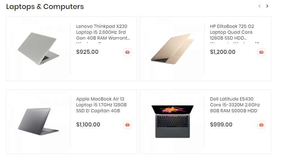
The Category Products element helps to show products by category with different view options (grid, list, slider, category tabs).

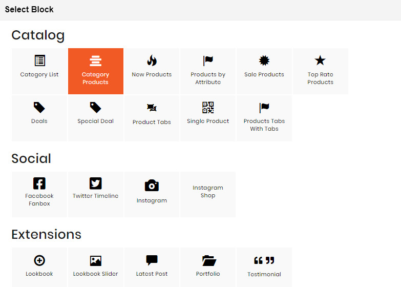
- On Builder editor, click Add New Block button.
- On popup list blocks, click “Category Products” item.
CONFIG BLOCK
Product Config Tab
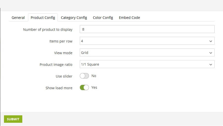
- Number of product to display: Limit the number of products shown.
- Item per row: Limit the number of items in a row on default resolution.
- Item per row (tablet): Limit the number of items in a row on tablet.
- Item per row (mobile): Limit the number of items in a row on mobile.
- View Mode:
- Grid Mode
- List Mode
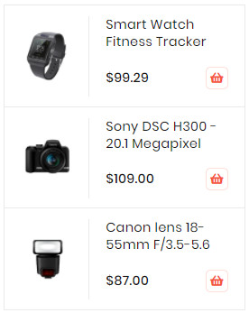
- Grid Mode
- Hide Product Name: Choose Yes to let the product name disappear.
- Hide Review: Choose Yes to let the product review disappear.
- Hide Price: Choose Yes to hide the product price.
- Hide Add to Cart: Choose Yes to hide the Add to Cart button.
- Hide Add to Wishlist: Choose Yes to hide the Add to Wishlist button.
- Hide Add to Compare: Choose Yes to hide the Add to Compare button.
- Use Slider: Choose Yes to add Carousel Slider for block product.If you use slider, you can
see more config to owl slider:
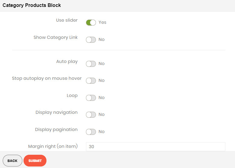
- RTL:Choose Yes to enable the Right to Left layout.
- Number of row: The number of rows displayed in slider.
- Auto play: Choose Yes to let the slide play automatically.
- Stop autoplay on mouse hover: Choose Yes to stop the slide from playing when hover mouse.
- Loop: Choose Yes to let the slide play in loop.
- Display navigation: Choose Yes to display the navigation icons on the slide.
- Display pagination: Choose Yes to display the pagination indicator on the slide.
- Navigation slide by: Limit the number of items will be shown after each time you click on the navigation.
Demo Product Slider:
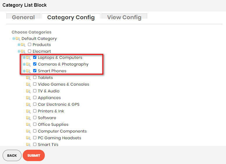
Category Config Tab

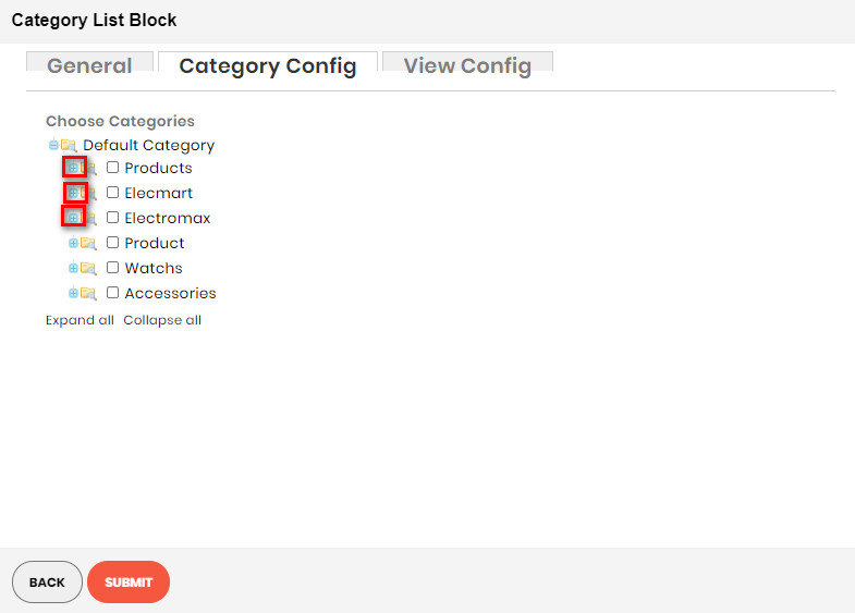


- Click plus icon button to show sub categories.
- Choose categories to filter product by selecting categories.
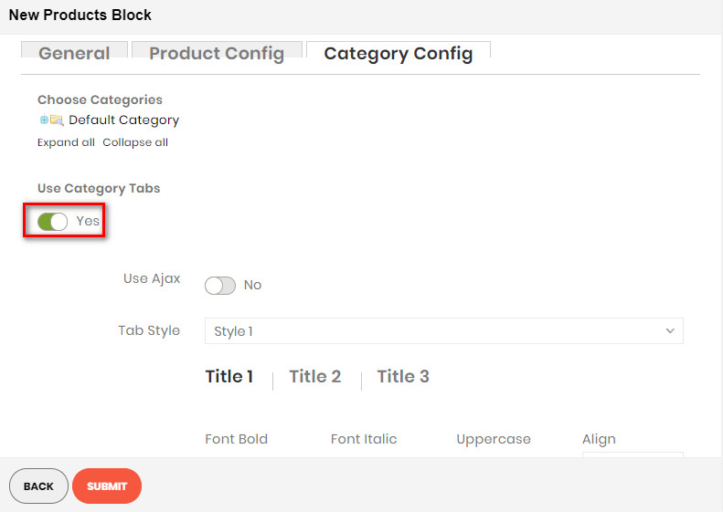
- If you want show product with tab. Change Use Category Tabs to Yes
- There you can see more settings for tab slide:
- Tab Style: Choose one of the 7+ style in the list. You can see the demo below.
- Font Bold, font Italic, Uppercase: Choose Yes to let the text in bold, in italic or in uppercase.
- Align: Choose among Left, Center or Right for text align.
- Font Size: Enter the value of font size (in px unit).
- Primary Color, Secondary Color and Third Color: Choose the 3 main color for your category tab. You can enter the hex code color directly in the blank or use color picker tool at the right.
Demo New Product With Tab:
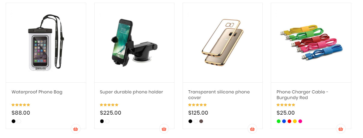
NEW PRODUCT BLOCK
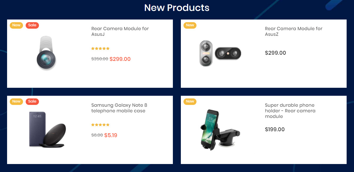
The New Products element helps to show new products, new product by categories with different view options (grid, list, slider, category tabs).
CONFIG NEW PRODUCT
CREATE NEW PRODUCT BLOCK
PRODUCT BY ATTRIBUTE BLOCK
The Products By Attribute element helps to show products by attribute (Yes/No) with different view options (grid, list, slider, category tabs).
Create (Yes/No) Attribute Product
CREATE PRODUCT ATTRIBUTE BUILDER
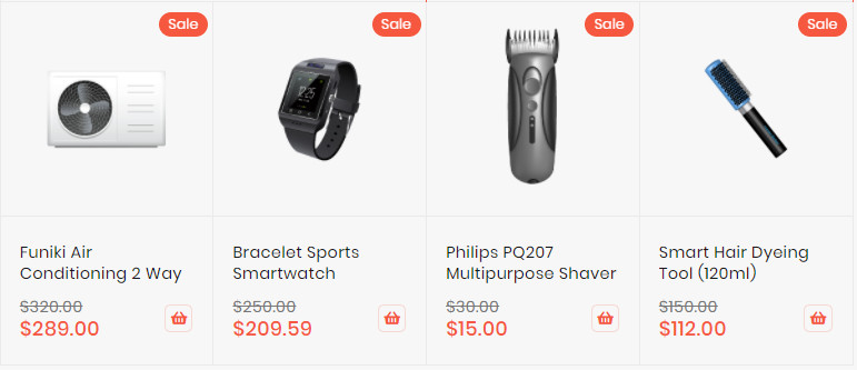
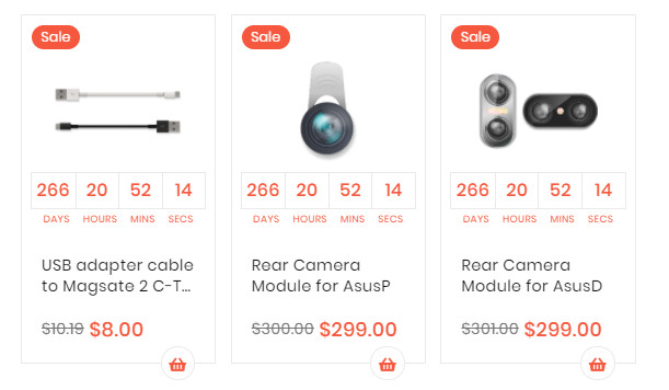
SALE PRODUCTS BLOCK
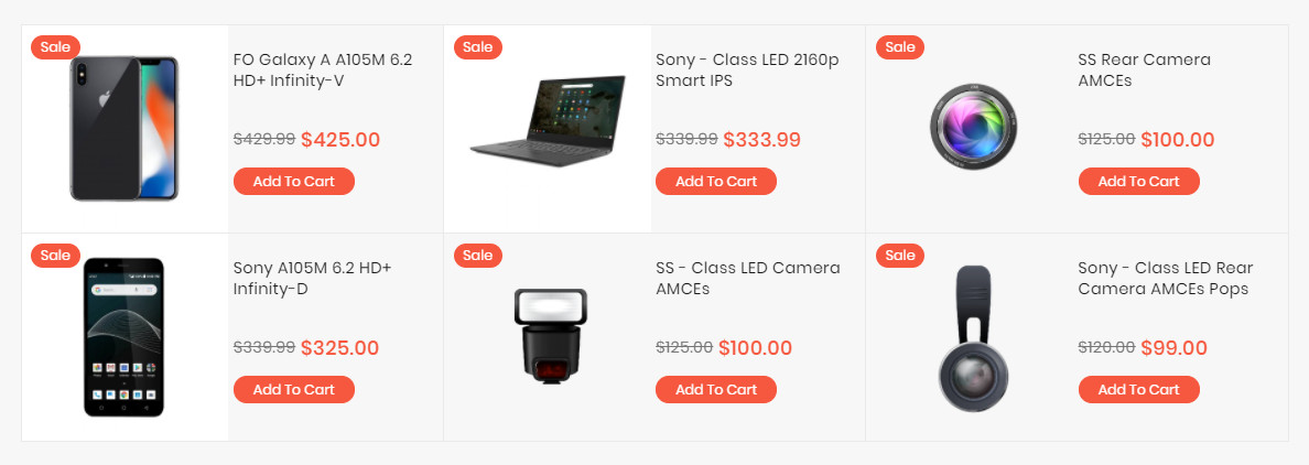
The Sale Products element helps to show sale products, new product by categories with different view options (grid, list, slider, category tabs).
Config Product to Sale
CREATE SALES PRODUCT BLOCK
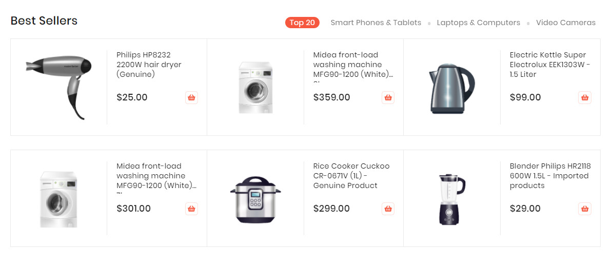
TOP RATE PRODUCTS BLOCK
The Top Rate Products element helps to show top rate products with different view options (grid, list, slider, category tabs).

- On Builder editor, click Add New Block button.
- On popup list blocks, click “Top Rate Products” item.
CONFIG BLOCK
Product Config Tab
- Number of product to display: Limit the number of products shown.
- Item per row: Limit the number of items in a row on default resolution.
- Item per row (tablet): Limit the number of items in a row on tablet.
- Item per row (mobile): Limit the number of items in a row on mobile.
- View Mode:
- Grid Mode
- List Mode
- Grid Mode
- Hide Product Name: Choose Yes to let the product name disappear.
- Hide Review: Choose Yes to let the product review disappear.
- Hide Price: Choose Yes to hide the product price.
- Hide Add to Cart: Choose Yes to hide the Add to Cart button.
- Hide Add to Wishlist: Choose Yes to hide the Add to Wishlist button.
- Hide Add to Compare: Choose Yes to hide the Add to Compare button.
- Use Slider: Choose Yes to add Carousel Slider for block product.If you use slider, you can
see more config to owl slider:
- RTL:Choose Yes to enable the Right to Left layout.
- Number of row: The number of rows displayed in slider.
- Auto play: Choose Yes to let the slide play automatically.
- Stop autoplay on mouse hover: Choose Yes to stop the slide from playing when hover mouse.
- Loop: Choose Yes to let the slide play in loop.
- Display navigation: Choose Yes to display the navigation icons on the slide.
- Display pagination: Choose Yes to display the pagination indicator on the slide.
- Navigation slide by: Limit the number of items will be shown after each time you click on the navigation.
Demo Product Slider:
Category Config Tab

- Click plus icon button to show sub categories.
- Choose categories to filter product by selecting categories.
- If you want show product with tab. Change Use Category Tabs to Yes
- There you can see more settings for tab slide:
- Tab Style: Choose one of the 7+ style in the list. You can see the demo below.
- Font Bold, font Italic, Uppercase: Choose Yes to let the text in bold, in italic or in uppercase.
- Align: Choose among Left, Center or Right for text align.
- Font Size: Enter the value of font size (in px unit).
- Primary Color, Secondary Color and Third Color: Choose the 3 main color for your category tab. You can enter the hex code color directly in the blank or use color picker tool at the right.
Demo New Product With Tab:
DEALS BLOCK
The Deal Products element helps to show deal products with different view options (grid, list, slider, category tabs).
CONFIG DEAL PRODUCT
DEALS PRODUCT
SPECIAL DEAL
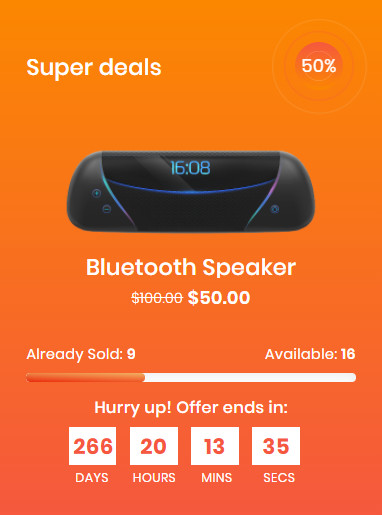
If you imported a demo homepage, you only need to enable the builder and edit it.
CONFIG SPECIAL DEAL PRODUCT
SPECIAL DEALS PRODUCT
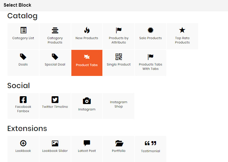
PRODUCT TABS BLOCK
The Product Tabs element helps to Display products as tabs with many options.
If you imported a demo homepage, you only need to enable the builder and edit it.
- On Builder, click Add New Block button.
- On popup list blocks, click “Product Tabs” item.
CONFIG BLOCK
Tab Config Tab
- New Products, Sale Products, Top Rate Products : Enable and Config Title & Position
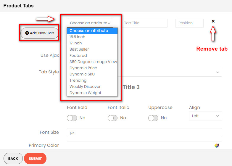
- Click Add new tab button to add new tab.
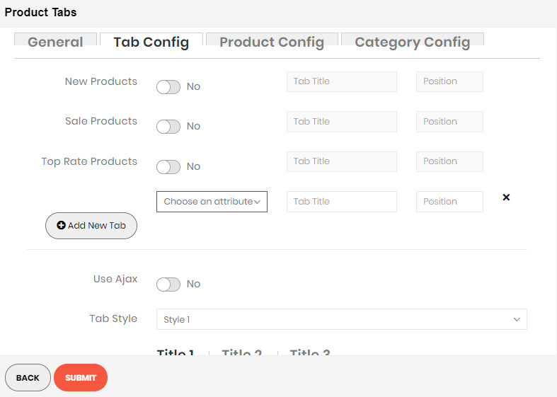
- Choose an attribute to tab.
Product Config Tab
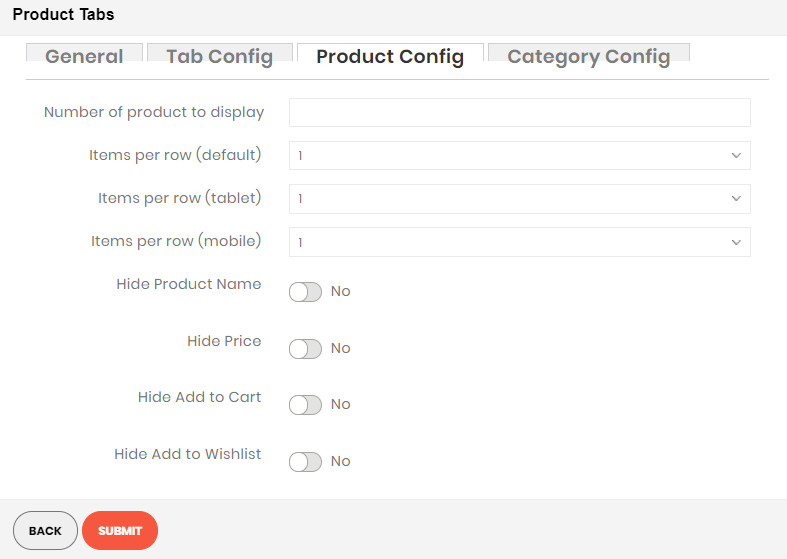
- Number of product to display: Limit the number of products shown.
- Item per row: Limit the number of items in a row on default resolution.
- Item per row (tablet): Limit the number of items in a row on tablet.
- Item per row (mobile): Limit the number of items in a row on mobile.
- View Mode:
- Grid Mode
- List Mode
- Grid Mode
- Hide Product Name: Choose Yes to let the product name disappear.
- Hide Review: Choose Yes to let the product review disappear.
- Hide Price: Choose Yes to hide the product price.
- Hide Add to Cart: Choose Yes to hide the Add to Cart button.
- Hide Add to Wishlist: Choose Yes to hide the Add to Wishlist button.
- Hide Add to Compare: Choose Yes to hide the Add to Compare button.
- Use Slider: Choose Yes to add Carousel Slider for block product.If you use slider, you can see
more config to owl slider:
- RTL:Choose Yes to enable the Right to Left layout.Number of row: The number of rows displayed in slider.Auto play: Choose Yes to let the slide play automatically.Stop autoplay on mouse hover: Choose Yes to stop the slide from playing when hover mouse.Loop: Choose Yes to let the slide play in loop.Display navigation: Choose Yes to display the navigation icons on the slide.Display pagination: Choose Yes to display the pagination indicator on the slide.Navigation slide by: Limit the number of items will be shown after each time you click on the navigation.
Demo Product Slider:
Category Config Tab


- Click plus icon button to show sub categories.
- Choose categories to filter product by select categories.
SINGLE PRODUCT BLOCK

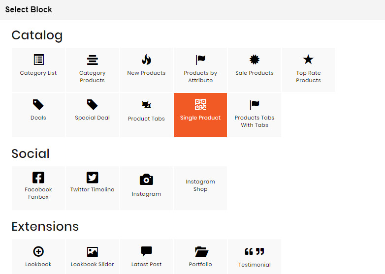
- On Builder editor, click Add New Block button.
- On popup list blocks, click “Single Product” item.
CONFIG BLOCK
Product Config Tab
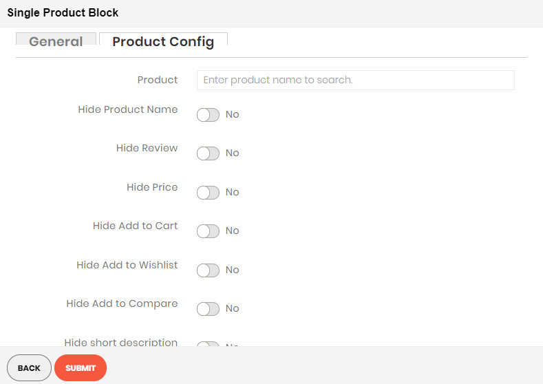
- Product:
- Enter product name and wait for the system to search the product.
- Choose product on suggested search results.
- Hide Product Name: Choose Yes to let the product name disappear.
- Hide Review: Choose Yes to let the product review disappear.
- Hide Price: Choose Yes to hide the product price.
- Hide Add to Cart: Choose Yes to hide the Add to Cart button.
- Hide Add to Wishlist: Choose Yes to hide the Add to Wishlist button.
- Hide Add to Compare: Choose Yes to hide the Add to Compare button.
- Hide Short Description: Choose Yes to hide the short description of product.
- Truncate short description: Insert directly the short description you want.