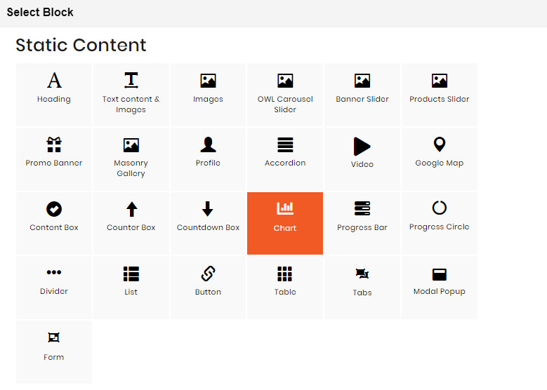
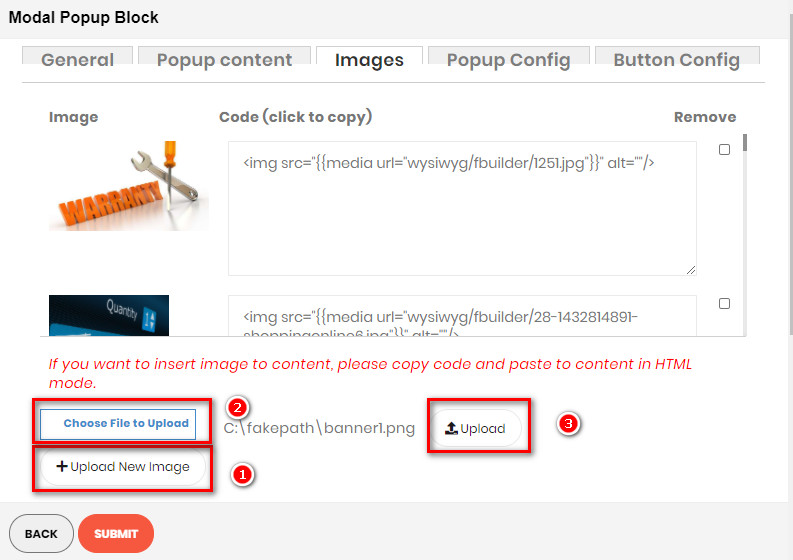
UPLOAD IMAGES WITH BUILDER ELEMENTS
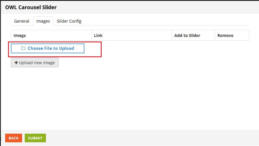
IMAGES TAB
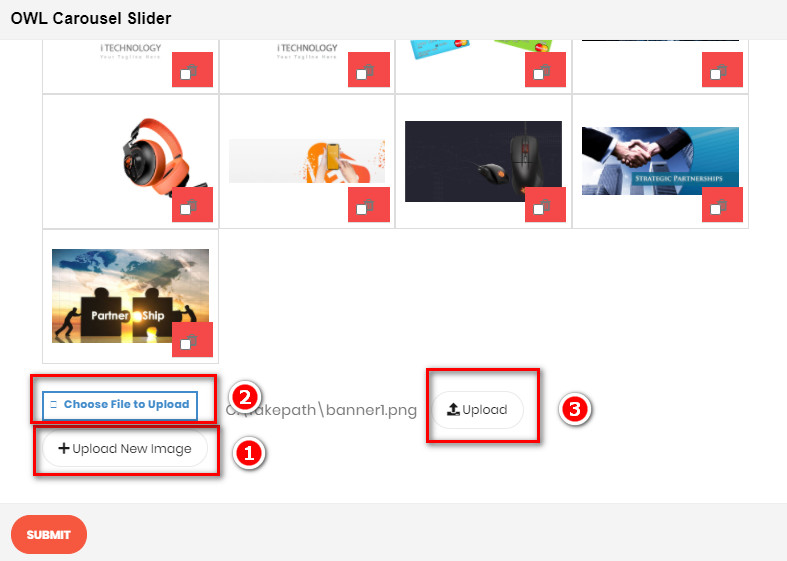
- To upload new image, click Upload new Image. button
- Click Choose File to Upload button, choose an image from your computer.
- Click Upload button and wait for the system to load.
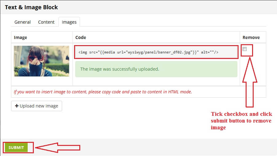
- After image uploaded, you can see new row on table image.
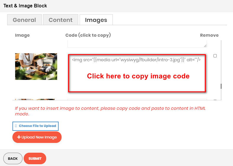
- Code: You can copy this code and back to Content tab to insert image.
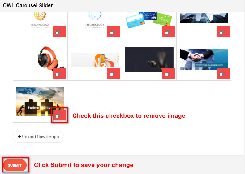
- Remove: If you want to remove image, tick checkbox on image row.
- Click Submit button then this image will be successfully removed.
HEADING STATIC BLOCK
Demo
The Heading Element,from h1 to h6 with many options (text align, font, color, border…) helps to make the heading as you want.
To see the visual demonstration, click here.
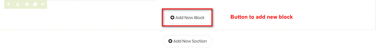
On Home page builder, click Add New Block button.
On popup list blocks, click "Heading" item.
HEADING CONFIG TAB
GENERAL
Here you can setting some general options for your banner as general color, background color or image and some other settings, just select and experience
CONTENT CONFIG
Here you can configure the heading content as follows:
- Heading: Type of heading. H1 is the biggest heading and H6 is the smallest one.
- Heading text: Content of heading.
- Text align: 3 types of align: Left, Center and Right.
- Font Size, Font Color, Font Bold, Font Italic, Uppercase: Configuration to customize the heading.
- Show border: Enable to display a border under heading.
After completing your configuration, just click Submit button to save your block.
TEXT CONTENT & IMAGES
If you import a sample homepage and had some sample static blocks, you only need to enable the builder then edit directly on the frontend.
Demo:
Demo of 4 “Text and images” blocks in a section
Demo of “Text and images” block applied for Newsletter section
If you want to create a new one, please follow below steps:
On home page, after creating new section, you can see button Add new block. Click this button, you can see popup list blocks.
On popup list blocks, click “Text content & Images” item.
CONFIG BLOCK
CONTENT
Click SHOW / HIDE EDITOR
Then you can add your content ( text/html ) to it
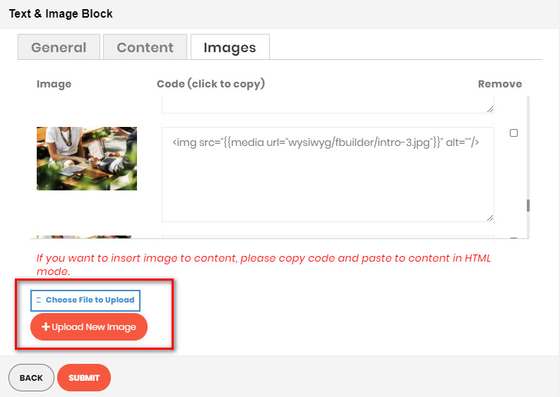
IMAGES
To upload new image, click Upload new Image. button
Then if you want to add an image to the content, click directly on code to copy:
Then paste to the content in Content tab
After completing the configuration, click SUBMIT button to create a static block
IMAGES BLOCK
Demo
Image element includes 2 types of image frames (“Single Image” and “Before & After”) with 7 hover effects to help your images stand out.
To see the visual demonstration, click here.
On Home page builder, click Add New Block button.
On popup list blocks, click “Images” button.
CONFIG BLOCK
VIEW CONFIG TAB
- Block Type: Choose display type for your image.
- Image: Click the button to choose the image file from your computer.
- Effect: Click to choose the effect for your image.
- Use Lightbox: Choose Yes to display the Lightbox.
- Url: Enter the Url that you want your image to be linked to.
- Border Width: Enter the width value you want for your image border. (px unit)
- Border Color: Enter the HEX color value you want for your image border. Or you can choose the color picker tool nearby.
- Border Radius: Enter the radius value you want for your image.
- Box Shadow: Choose Yes to display the shadow of your image.
Click SUBMIT button to save config and create image block.
OWL CAROUSEL SLIDER
Demo
OWL Carousel element helps to create a beautiful, responsive carousel slider for your webpage.
To see the visual demonstration, click here.
– Click here to set backend configurations for Single Slide OWL Carousel.
– Click here to set backend configurations for Multiple Slides OWL Carousel.
On Home page builder, click Add New Block button.
On popup list blocks, click “Owl Carousel Slider” button.
CONFIG BLOCK
MANAGE IMAGES TAB
- Upload New Image
- Click Upload new Image button.
- Click Choose File to Upload button. Select an image from your computer.
- Click Upload button.
- After image uploaded, you can config link for image or remove it. View screenshot for more details.
MANAGE SLIDE TAB
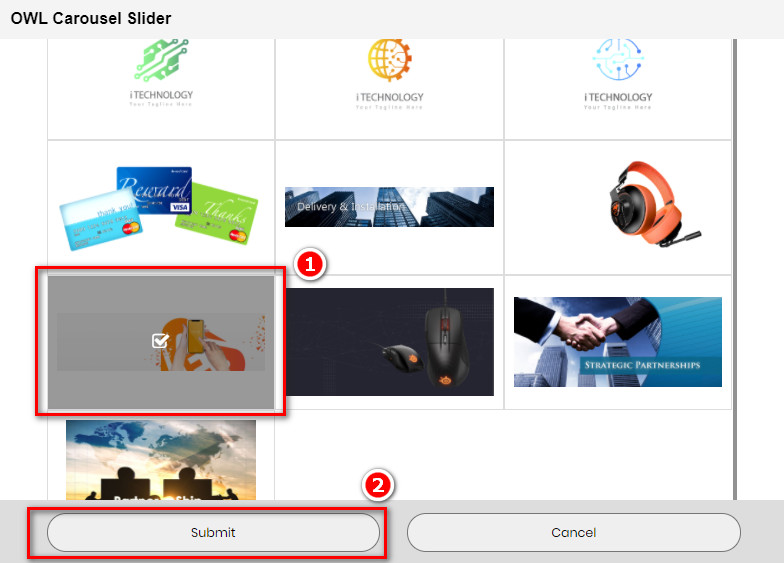
- Click the Add New Slide button to add a new slide for your slider.
- Choose the image you want to add to slide, and then click Submit button.
- Do it respectively to add more slides.
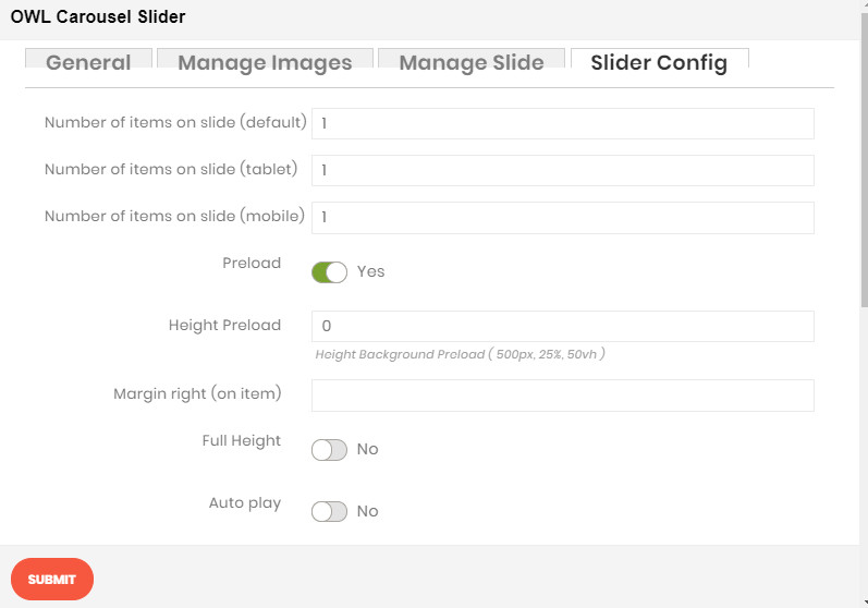
SLIDER CONFIG TAB
- Number of items on slide (3 resolutions): Default value is 1 image on a slide for correlative resolution.
- Preload: Choose Yes to enable the preload.
- Height Preload: Enter the height value for the preload
- Margin right: The value of the right margin on each item.
- RTL: Choose Yes to enable the Right to Left layout.
- Full Height: Choose Yes to let the slider be full its height.
- Auto play: Choose Yes to let the slider auto play.
- Auto play speed: Display when auto play is Yes. Insert the value of auto play speed among slides.
- Stop auto play on mouse hover: Choose Yes to stop the slider from playing when user hover their mouse.
- Display navigation: Choose Yes to show the navigation icon on slide.
- Navigation position: Choose the place where navigation icons will be displayed.
- Auto hide navigation: Choose Yes to let the navigation disappear while no mouse hover event.
- Display pagination: Choose Yes to display the indicator on slide.
- Loop: Choose Yes to let the slide play in loop among images.
Click SUBMIT button to save config and create owl slider.
MASONRY GALLERY BLOCK
Demo
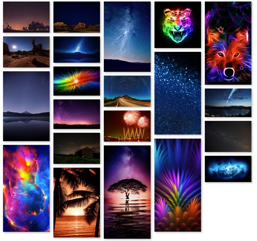
The Masonry Gallery element is perfect way to showcase a set of images.
To see the visual demonstration, click here.
On Home page builder, click Add New Block button.
On popup list blocks, click “Masonry Gallery” button.
CONFIG BLOCK
MANAGE IMAGES TAB
See how to upload image here.
MASONRY CONFIG TAB
- Number of columns: Number of columns displayed in Gallery.
- Item margin: Enter the margin value among images.
- Hover effect: Choose the effect when hover on image.
- Use LightBox: Choose Yes to use lightbox for the Gallery.
- Border Width: Enter the width value you want for your image border. (px unit)
- Border Color: Enter the HEX color value you want for your image border. Or you can choose the color picker tool nearby.
- Border Radius: Enter the radius value you want for your image.
- Box Shadow: Choose Yes to display the shadow of your image.
Click SUBMIT button to save config and create Masonry Gallery.
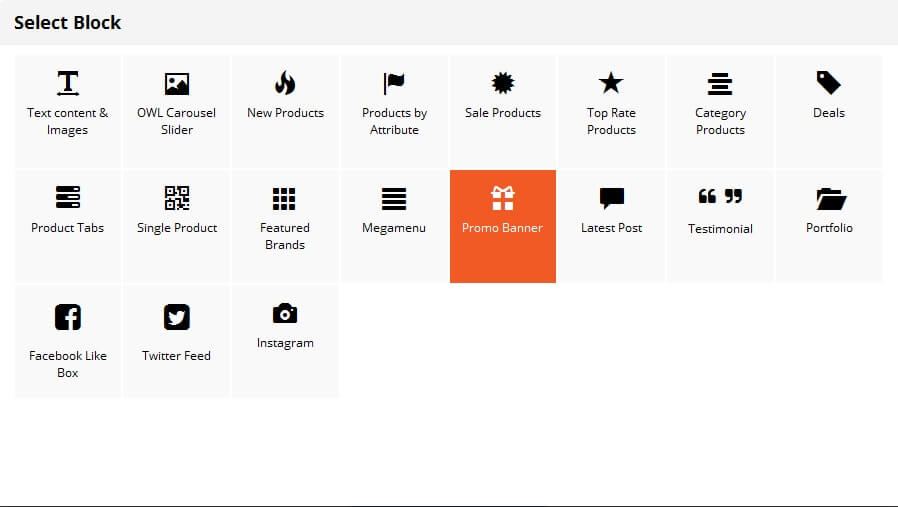
PROMOBANNER BLOCK
If you imported a sample homepage and had some sample promo banners, you only need to enable the builder then edit directly on the frontend.
Demo
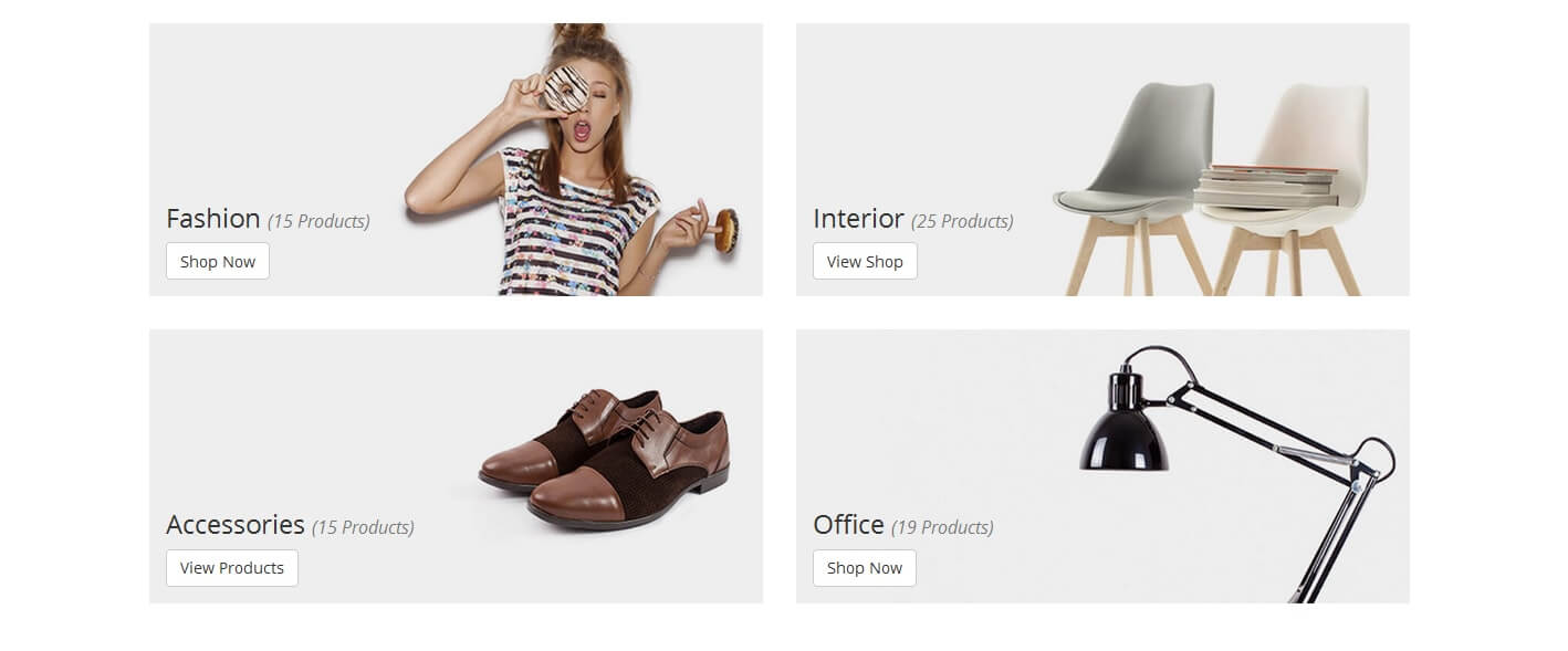
The Promo Banner element helps to create catchy banners with 11+ nicer effects.
To see the visual demonstration, click here.
On Home page builder, click Add New Block button.
On popup list blocks, click "Promo Banner" item.
BANNER CONFIG TAB
Here you can upload banner image, set url when you click on the banner, add text to banner, add button, adjust text's position, color of button,....
After completing your banner, just click Submit button to save your banner.
PROFILE BLOCK
Demo
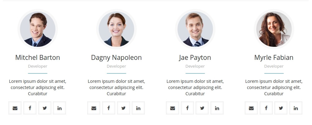
The Profile element with several customization options to utilise you have the power to display your staff, team or favourite people with style and ease.
To see the visual demonstration, click here.
On Home page builder, click Add New Block button.
On popup list blocks, click “Profile” button.
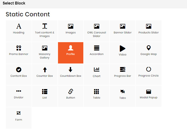
CONFIG BLOCK
PROFILE CONFIG TAB
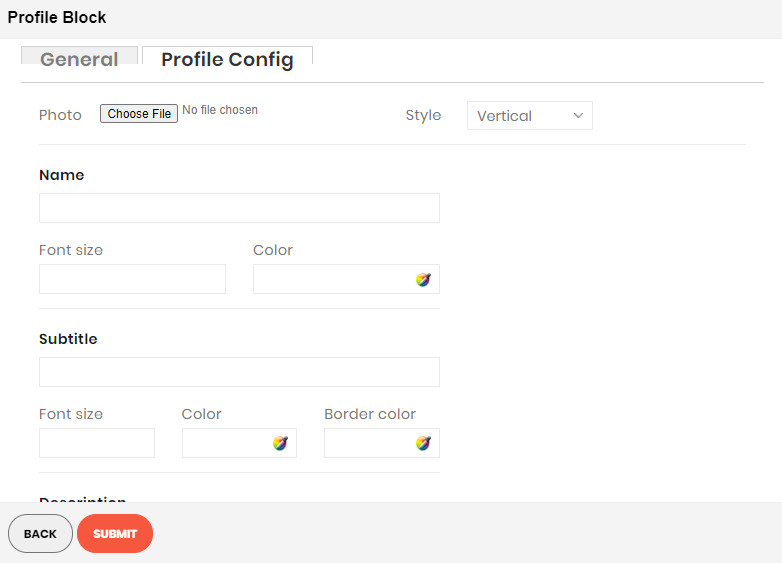
See how to upload image here.
Besides, you can make some configurations related to Name, Subtitle, Color… to customize your block.
Click SUBMIT button to save config and create Profile block.
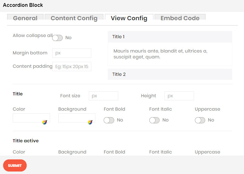
ACCORDION BLOCK
Demo
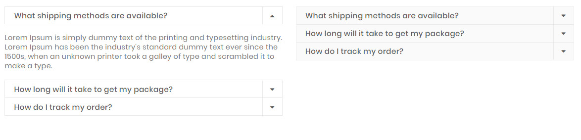
The Accordion element are perfect for adding multiple sections of varied content to your website, and actively selecting which to show or hide at any time..
To see the visual demonstration, click here.
On Home page builder, click Add New Block button.
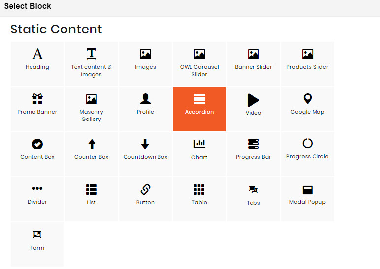
On popup list blocks, click “Accordion” button.
CONFIG BLOCK
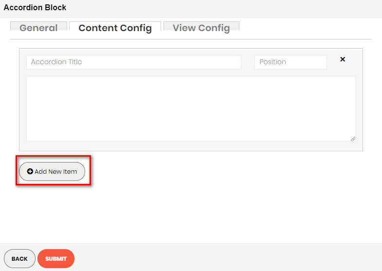
CONTENT CONFIG TAB
- Click Add New Item button to add a new accordion item.
- Insert the title, position and content of accordion in the blanks
- Do it similarly to add more accordion items..
VIEW CONFIG TAB
Enter values that you want to set for the accordion style, about color, title, icon, font style…
Click SUBMIT button to save config and create Masonry Gallery.
VIDEO BANNER BLOCK
Demo
The Video element helps to embed Youtube and Vimeo videos to your webpage with many options.
To see the visual demonstration, click here.
On Home page builder, click Add New Block button.
On popup list blocks, click "Video" item.
BANNER CONFIG TAB
GENERAL
Here you can setting some general options for your banner as general color, background color or image and some other settings, just select and experience
VIDEO CONFIG
Here you can:
- Video URL: Paste Youtube video URL or Vimeo video URL.
- Full Width: Enable to set your video as full screen width. If not, you can enter the fixed width and height value in px unit
- Autoplay: Enable to let the video play automatically.
- Hide video information: Enable to the video information be hidden.
- Hide video controls: Enable to the video control panel be hidden.
- Loop video: Enable to the video repeat.
- Mute: Enable to mute the video.
After completing your configuration, just click Submit button to save your block.
GOOGLE MAP BLOCK
Demo
The Map element helps to add Google map to your webpage.
To see the visual demonstration, click here.
On Home page builder, click Add New Block button.
On popup list blocks, click “Google Map” button.
CONFIG BLOCK
MAP CONFIG TAB

Enter values also needed settings that you want to set for the Google Map style.
Click Submit button to save your data.
CONTENT BOX BLOCK
Demo
The Content Box element helps to create content box with many options for your webpage.
To see the visual demonstration, click here.
On Home page builder, click Add New Block button.
On popup list blocks, click “Content Box” button.
CONFIG BLOCK
CONTENT CONFIG TAB

Enter values also needed settings that you want to set for the Content Box style, about the icon, title, description…
Click Submit button to save your data.
COUNTER BOX BLOCK
Demo
The Counter Box element helps to create animated counter elements for your webpage with many options.
To see the visual demonstration, click here.
On Home page builder, click Add New Block button.
On popup list blocks, click “Counter Box” button.
CONFIG BLOCK
CONTENT CONFIG TAB
Enter values also needed settings that you want to set for the Counter Box style, about the icon, title, description…
Click Submit button to save your data.
COUNTDOWN BOX BLOCK
Demo
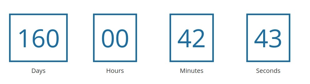
The Countdown Box element helps to show your visitors a countdown to a special event, sale, anniversary.
To see the visual demonstration, click here.
On Home page builder, click Add New Block button.
On popup list blocks, click “Countdown Box” button.
CONFIG BLOCK
CONTENT CONFIG TAB
Enter values also needed settings that you want to set for the Countdown Box style, about the date and text.
Click Submit button to save your data.
CHART BLOCK
Demo
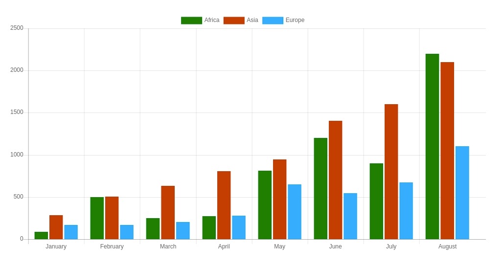
The Chart element is an elegant, powerful and beautiful tool that allows you to publish gorgeous charts.
To see the visual demonstration, click here.
On Home page builder, click Add New Block button.
On popup list blocks, click “Chart” button.
CONFIG BLOCK
CONTENT CONFIG TAB
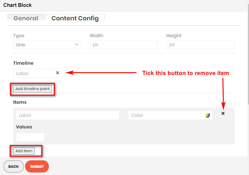
- Type: Choose type of chart.
- Width and Height: Set width and height for the chart.
- Timeline: Click Add timeline point button to add a new timeline point to the chart. Enter its label above.
- Items: Click Add item button to add a new item to the chart. Enter its information above.
PROGRESS BAR BLOCK
Demo
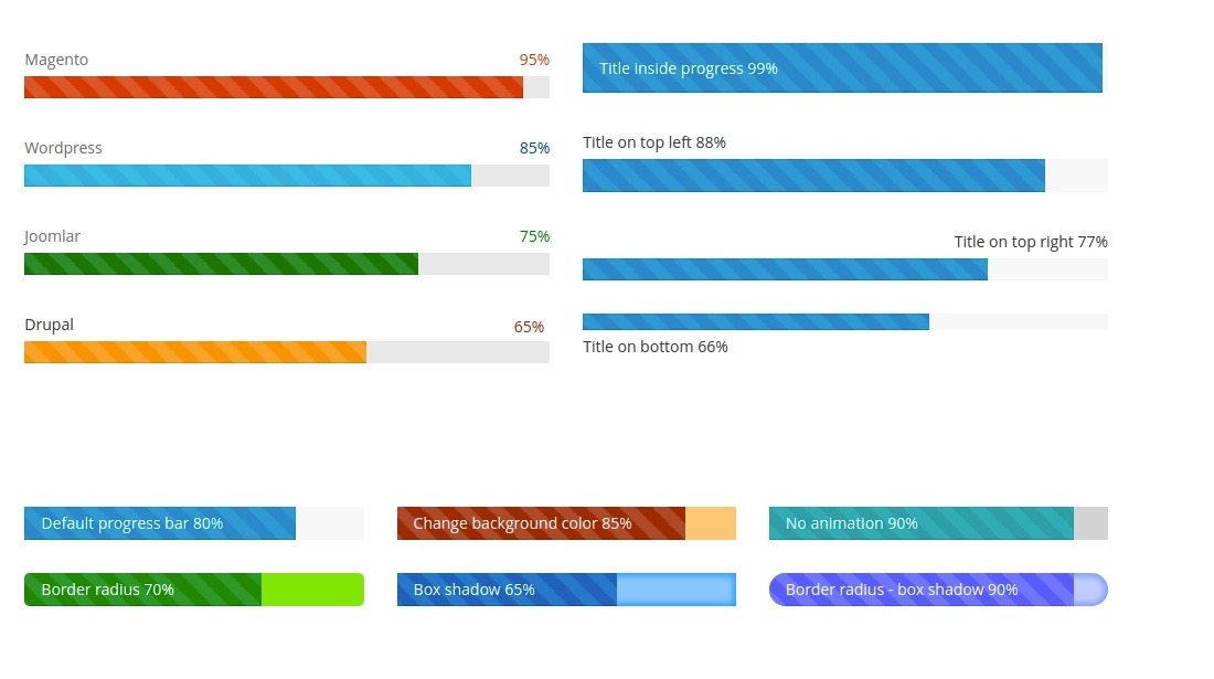
The Progress Bar element is a graphical control element used to visualize the progression of an extended operation such as a download, file transfer, or installation.
To see the visual demonstration, click here.
On Home page builder, click Add New Block button.
On popup list blocks, click “Progress Bar” button.
CONFIG BLOCK
CONTENT CONFIG TAB
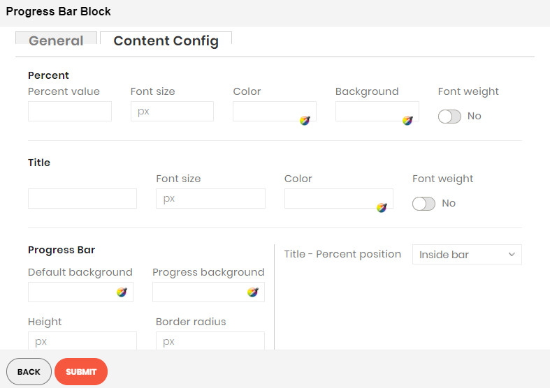
Enter values also needed settings that you want to set for the Progress Bar style, about the percent, title…
Click Submit button to save your data.
PROGRESS CIRCLE BLOCK
Demo
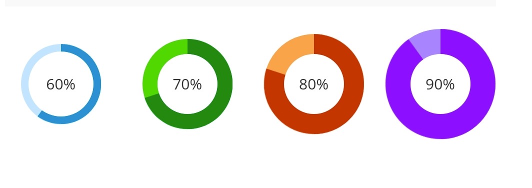
The Progress Circle element is a great way to visually attract the viewer and display content eg: sales percentages, skill levels, promotional levels.
To see the visual demonstration, click here.
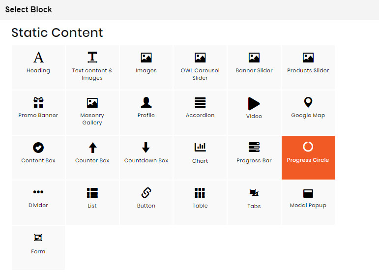
On Home page builder, click Add New Block button.
On popup list blocks, click “Progress Circle” button.
CONFIG BLOCK
CONTENT CONFIG TAB
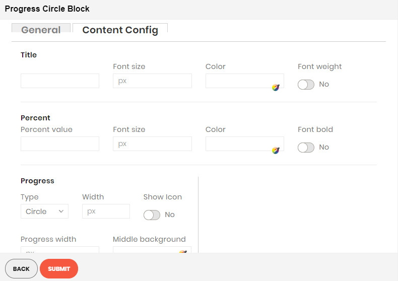
Enter values also needed settings that you want to set for the Progress Circle style, about the percent, title, progress…
Click Submit button to save your data.
DIVIDER BLOCK
Demo
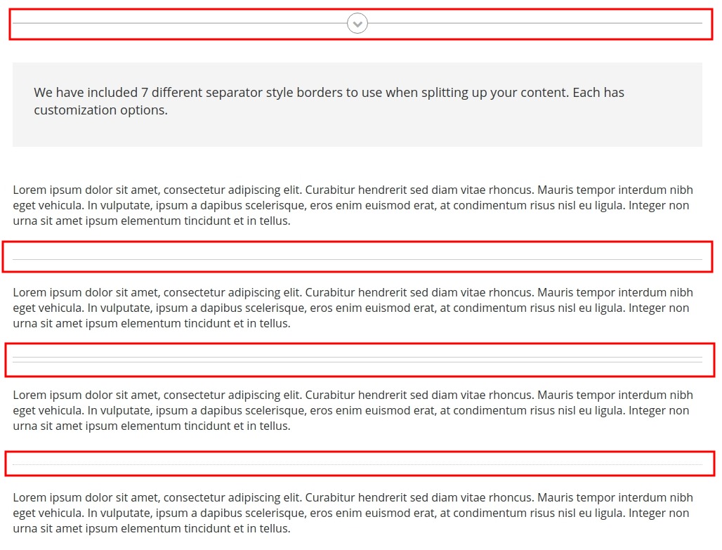
The Divider element are perfect to use to break up content and draw the users eye to the next section.
To see the visual demonstration, click here.
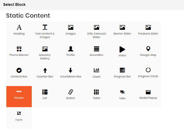
On Home page builder, click Add New Block button.
On popup list blocks, click “Divider” button.
CONFIG BLOCK
CONTENT CONFIG TAB
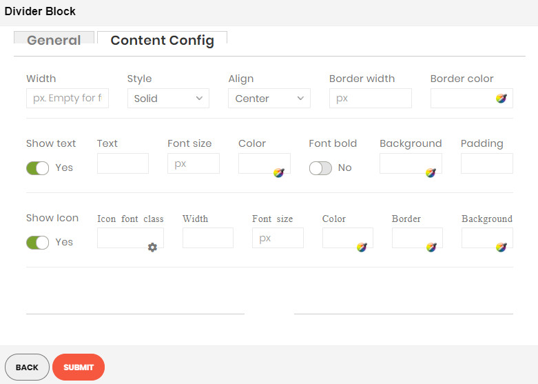
Enter values also needed settings that you want to set for the Divider style.
Click Submit button to save your data.
LIST BLOCK
Demo
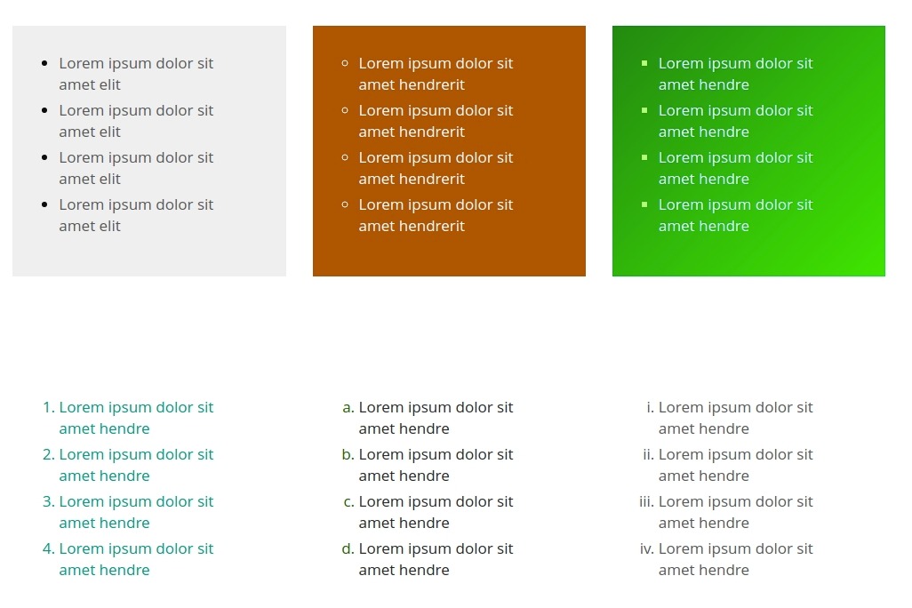
The Checklist element allows you to easily add beautifully styled lists anywhere to your site.
To see the visual demonstration, click here.
On Home page builder, click Add New Block button.
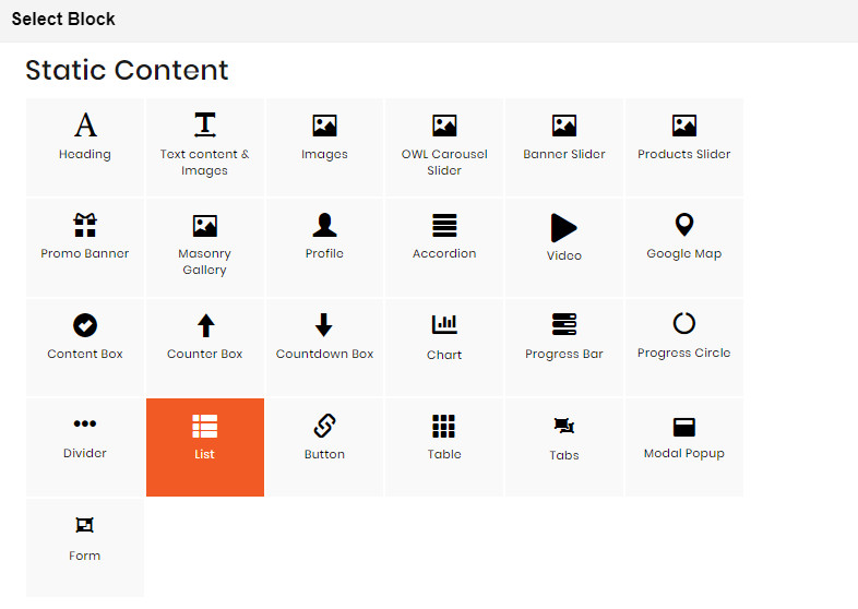
On popup list blocks, click “List” button.
CONFIG BLOCK
CONTENT CONFIG TAB
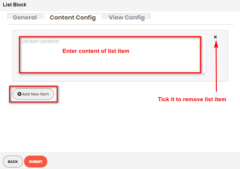
Click Add new item button to add a new list item. Enter its content in the blank above.
VIEW CONFIG TAB
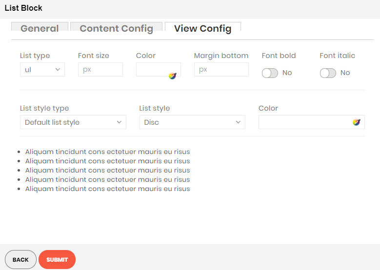
Enter values also needed settings that you want to set for the List style.
Click Submit button to save your data.
BUTTON BLOCK
Demo
The Button element are an integral part of your site, and we’ve made sure you have the options you need to add beautiful buttons to any page.
To see the visual demonstration, click here.
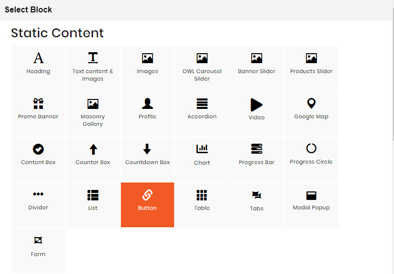
On Home page builder, click Add New Block button.
On popup list blocks, click “Button” button.
CONFIG BLOCK
CONTENT CONFIG TAB
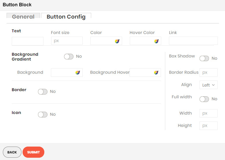
Enter values also needed settings that you want to set for the Button style.
Click Submit button to save your data.
TABLE BLOCK
Demo
The Table element helps to create eye-catching tables to display various kinds of content with unlimited columns.
To see the visual demonstration, click here.
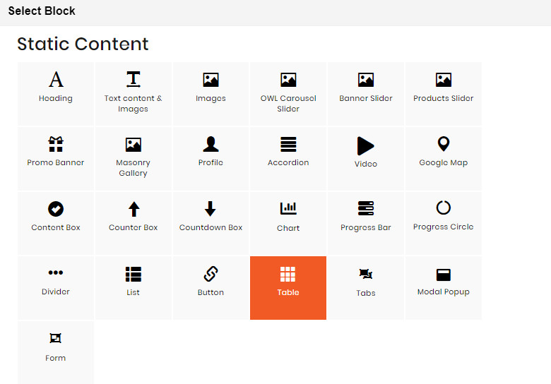
On Home page builder, click Add New Block button.
On popup list blocks, click “Table” button.
CONFIG BLOCK
TABLE CONFIG TAB
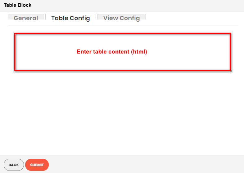
Click the table button to add a new table, or edit an existed one
Insert the table information in the box. Click Insert button to confirm.
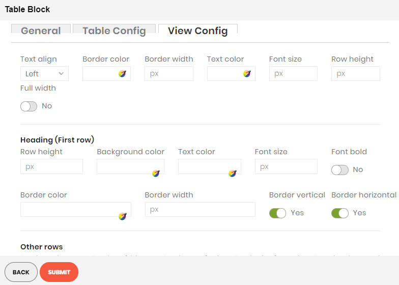
VIEW CONFIG TAB
Enter values also needed settings that you want to set for the Table style.
Click Submit button to save your data.
TAB BLOCK
Demo
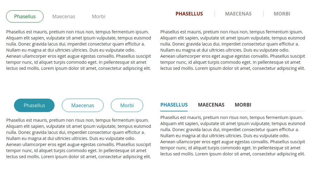
The Tabs element are perfect for displaying a bunch of organized information in a small area.
To see the visual demonstration, click here.
On Home page builder, click Add New Block button.
On popup list blocks, click “Tab” button.
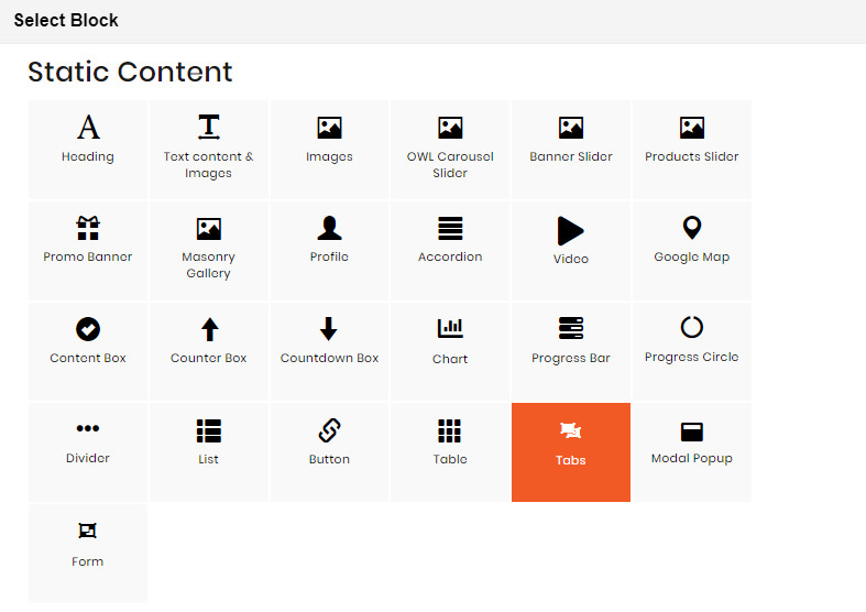
CONFIG BLOCK
CONTENT CONFIG TAB
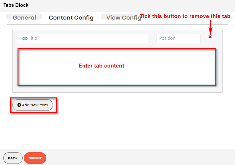
Click Add new item button to add a new tab. Enter its content in the blank above.
VIEW CONFIG TAB
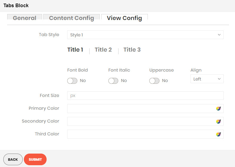
Enter values also needed settings that you want to set for the Tab style.
Click Submit button to save your data.
MODAL POPUP BLOCK
Demo
The Modal Popup element are perfect for displaying a bunch of organized information in a small area.
To see the visual demonstration, click here.
On Home page builder, click Add New Block button.
On popup list blocks, click “Modal Popup” button.
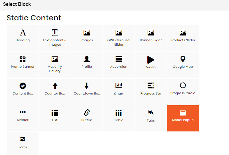
CONFIG BLOCK
POPUP CONTENT TAB
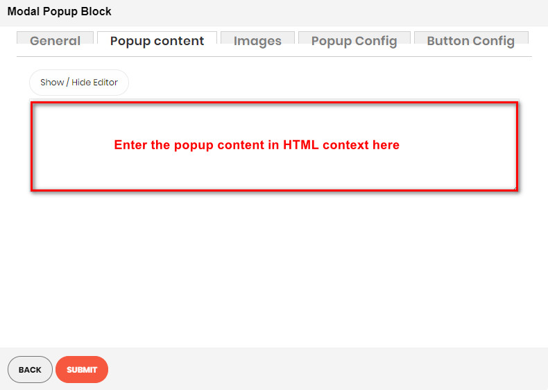
Using the editor, you can directly insert the content you want for your popup.
Otherwise, you can click Show/Hide Editor button to enter the content in HTML context.
IMAGES TAB
See how to upload image here.
POPUP CONFIG TAB
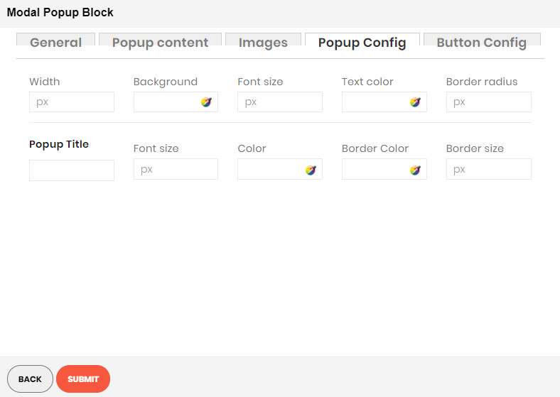
Enter values also needed settings that you want to set for the Popup style.
BUTTON CONFIG TAB
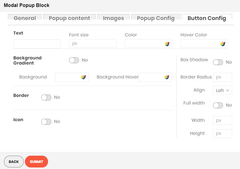
Enter values also needed settings that you want to set for the button style. You can see the preview directly after you change values.
Finally, click Submit button to save your data.
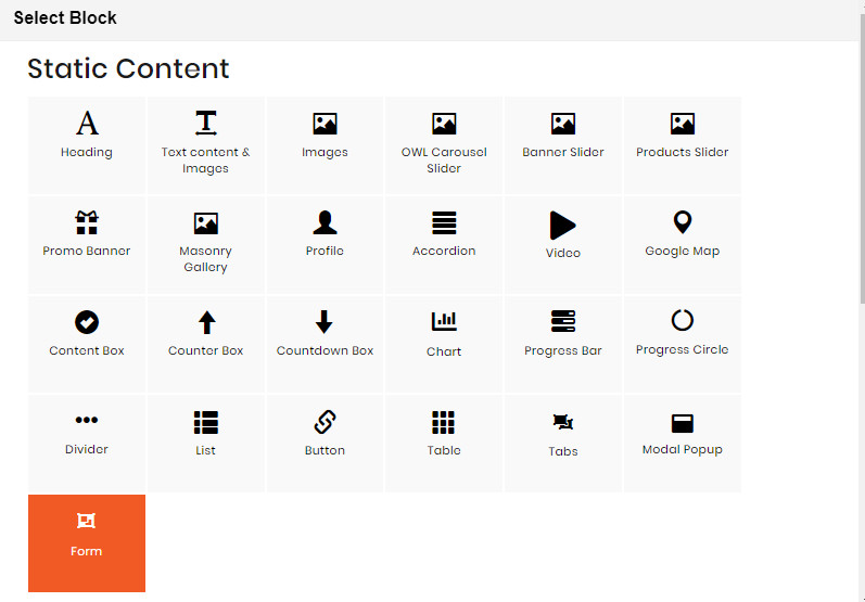
FORM BLOCK
Demo
The Form element helps to create send mail form with 8 different input types: text field, textarea, file, dropdown, radios, checkbox, multiple select, date.
To see the visual demonstration, click here.
On Home page builder, click Add New Block button.
On popup list blocks, click “Form” button.
CONFIG BLOCK
FIELDS CONFIG TAB
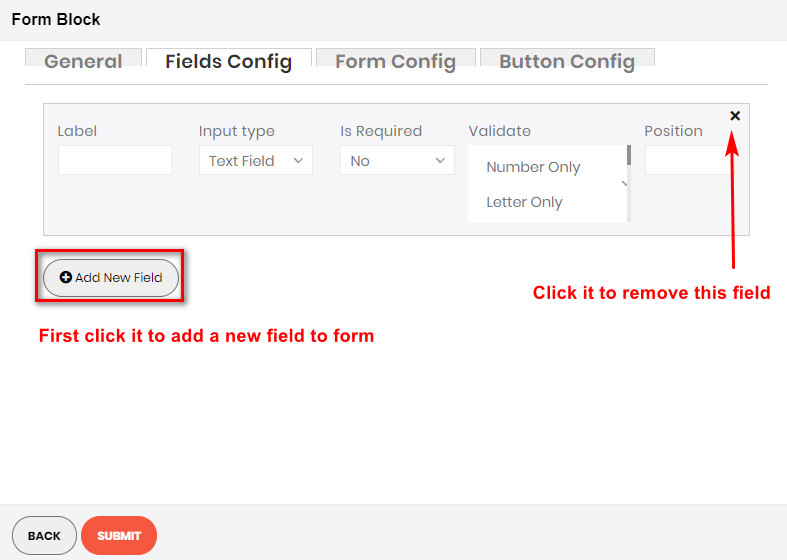
Click Add new field button to add a new field to form. Enter its information in the blanks above.
FORM CONFIG TAB
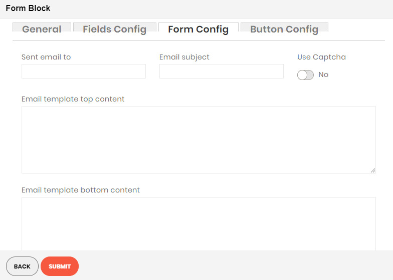
Enter needed settings for your form:
- Send email to: Enter the email address of the recipient.
- Email subject: Enter the email subject for the mail.
- Use Captcha: Click to enable the captcha in the form.
- Email template top content: Enter the content for the top of the response email.
- Email template bottom content: Enter the content for the bottom of the response email.
- Success message: Enter the success message you want to show.
BUTTON CONFIG TAB
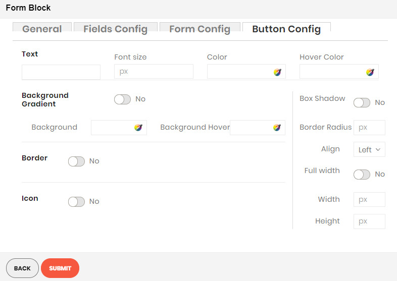
Enter values also needed settings that you want to set for the button style. You can see the preview directly after you change values.
Finally, click Submit button to save your data.