Go to Admin -> Online Store -> Themes -> Customize -> Theme settings -> Footer

Within Footer, you can config:
Footer version: We have 4 styles of footer for you on Lusion 2. Each of version has a diffirent style.
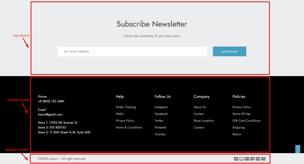
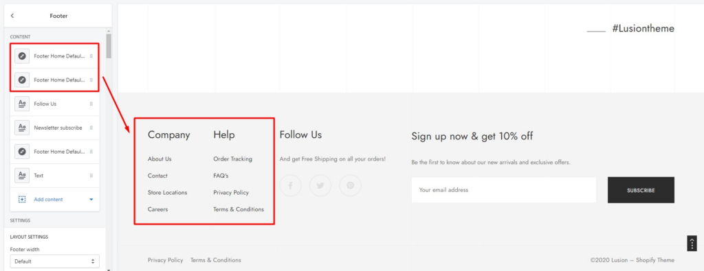
Footer main part
1. SECTION SETTINGS
- Footer width:
Default(follow setting Width on Theme Settings – General) orFull width. - Custom width: This settings only works with footer width has value default .
- Settings for Background: Settings for footer’s background.
- Settings for Border & Spacing: Settings for footer’s border & margin, padding.
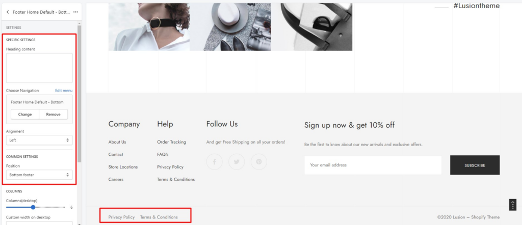
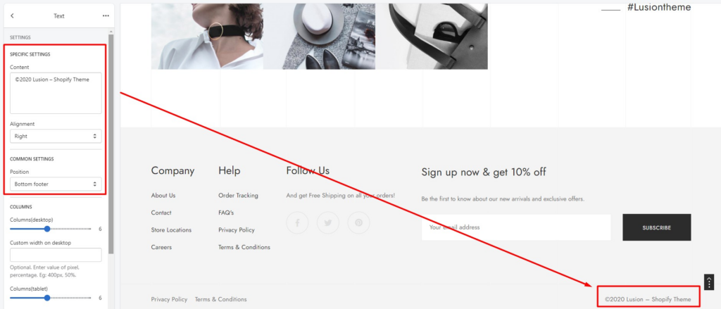
- Settings for Top, middle & bottom footer: We’ve separated the footer to 3 parts: top, middle & bottom footer. We can change the background, text, links & icons color of each part. Each version of footer will have some parts or all 3 parts.
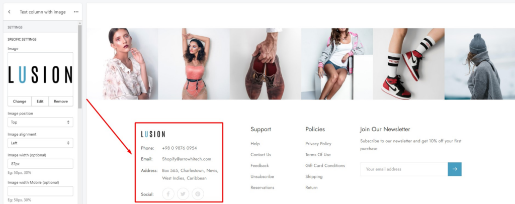
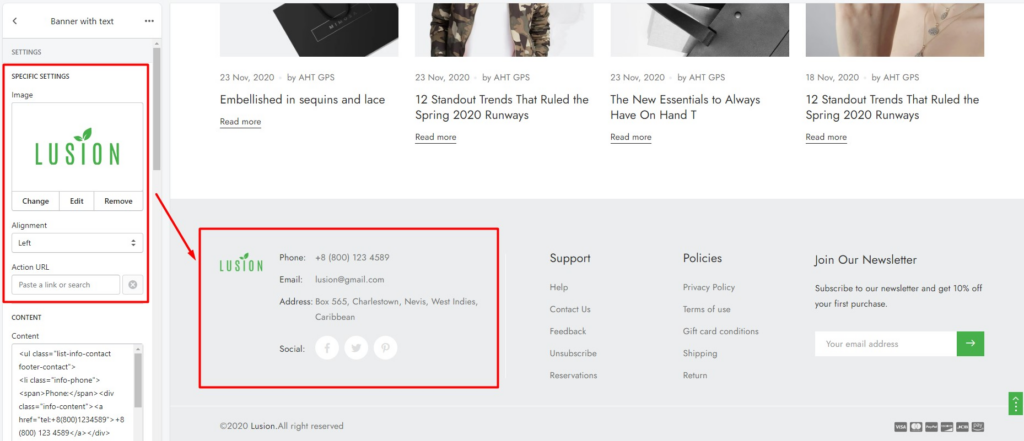
2. BLOCK: TEXT COLUMN WITH IMAGE
- Image: Image that will show on block.
- Image position: Above or below, left or right of the HTML content.
- Image alignment: Setting the alignment of image on this block. Left, center or right.
- Image width (optional): Setting the width of image on this block. This is optional.
- Content: HTML content will show on block.
- Content alignment: Setting the alignment of all elements on this block. Left, center or right.
- Social: Show social link. You can config in Theme settings – Social media.
- Position: Define this block will show on top, middle or bottom footer.
- Columns: Define width of this block.
- Custom width: Define width of block instead columns.
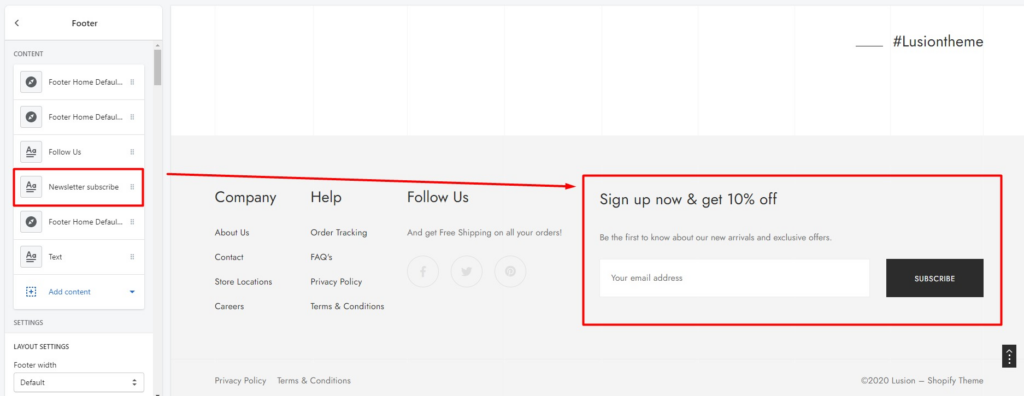
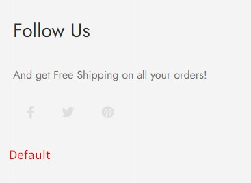
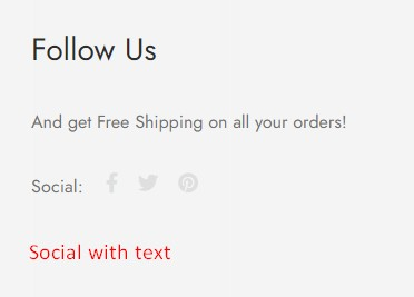
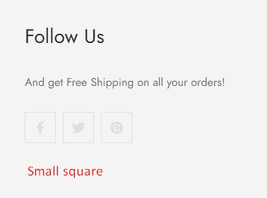
3. BLOCK: NEWSLETTER SUBSCRIBE
- Title & description: Content of block.
- Social link: Show social links below the form.
- Content alignment: Define the alignment of content on this block.
- Style newsletter: 8 of types layout.
- Position: Define this block will show on top, middle or bottom footer.
- Columns: Define width of this block.
- Custom width: Define width of block instead columns.
4. BLOCK: VERTICAL LINK LIST
- Heading content: Heading HTML content.
- Choose Navigation: Define the Navigation that will show on this block.
- Alignment: Setting the alignment of all elements on this block. Left, center or right.
- Show toggle tablet & mobile: In tablet & mobile, this block will become a toggle.
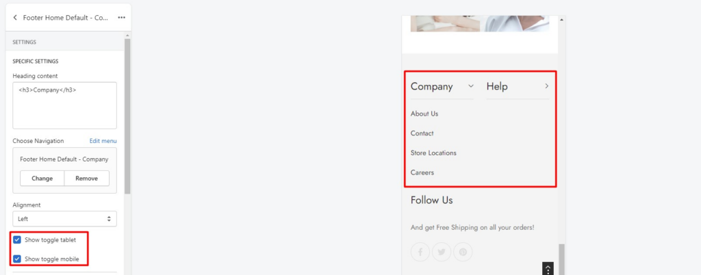
- Position: Define this block will show on top, middle or bottom footer.
- Columns: Define width of this block.
- Custom width: Define width of block instead columns.
5. BLOCK: HORIZONTAL LINK LIST
- Heading content: Heading HTML content.
- Choose Navigation: Define the Navigation that will show on this block.
- Alignment: Setting the alignment of all elements on this block. Left, center or right.
- Position: Define this block will show on top, middle or bottom footer.
- Columns: Define width of this block.
- Custom width: Define width of block instead columns.
6. BLOCK: TEXT
- Content: Define content of this block.
- Alignment: Setting the alignment of all elements on this block. Left, center or right.
- Position: Define this block will show on top, middle or bottom footer.
- Columns: Define width of this block.
- Custom width: Define width of block instead columns.
7. BLOCK: BANNER WITH TEXT
- Image: Define content of this block.
- Alignment: Setting the alignment of all elements on this block. Left, center or right.
- Position: Define this block will show on top, middle or bottom footer.
- Columns: Define width of this block.
- Custom width: Define width of block instead columns.
- Other settings of this block are same as block of section
Banner.
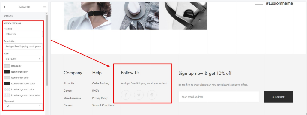
8. BLOCK: SOCIALS
- Heading & Description: Content of block.
- Style: Content of block.
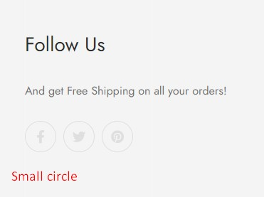
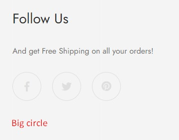
- Alignment: Setting the alignment of all elements on this block. Left, center or right.
- Position: Define this block will show on top, middle or bottom footer.
- Columns: Define width of this block.
- Custom width: Define width of block instead columns.